Further confusing headlines from the robot uprising front lines: Photographer Disqualified From AI Image Contest After Winning With Real Photo and Real Photo Disqualified From Photography Contest For Being AI. It’s just so exhausting.
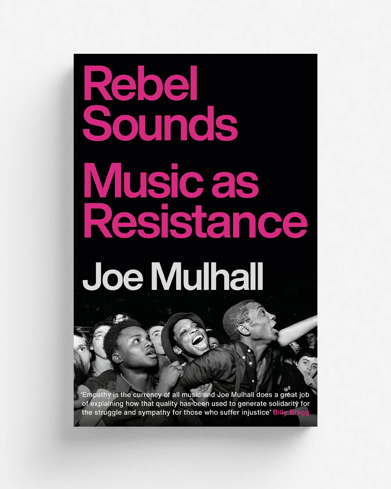
Rebel Sounds
An honour to have designed Joe Mulhall’s new book Rebel Sounds, coming from Footnote in September. Photograph of The Specials fans at Leeds Carnival in 1981, by the great Syd Shelton.
Kiosk
Kiosk: The Last Modernist Booths Across Central and Eastern Europe – a starkly beautiful photobook by Zupagrafika chronicling the vanishing Soviet-era kiosk designs across the ex-Soviet world. Every picture looks like it was dragged out of Owen D. Pomery‘s dreams.
Jen Orpin
No idea how I’ve lived this long without seeing Jen Orpin’s oil paintings of British motorways, but they are bloody gorgeous … Like illustrations from JG Ballard’s personal collection of Ladybird books, with a bit of Gerry Anderson roadside architecture thrown in for good measure
Magdalena Wywrot
Pestka, Magdalena Wywrot’s stunning new collection of black and white photography is … hang on, where’s the blurb … “a gravity-defying, through-the-looking-glass portrait of the life of a mother and her adolescent daughter, a series of time-lapse dispatches seemingly beamed from a hermetic space station suspended high above a planet (and Krakow, Poland) where time is literally standing still”

When your style becomes a trend
Fantastic and exceedingly timely Elizabeth Goodspeed piece, talking to creatives about on what happens when your style becomes a trend and is widely adopted, aped and AI-leeched. I particularly like the bit where Robert Beatty nails one brutal truth: “Style is your limitations showing through … The worst part of what you’re doing is what people latch on to”. Computers replicating our weaknesses. That can only end well, right?
Wire
Reading Rachel Cabitt’s latest, tracing the art school lineage of post-punk heroes Wire, and was reminded of this excellent quote on minimalism from Wilson Neate’s 33 1/3 book on Wire’s Pink Flag:
Wire’s aesthetic was built on subtraction, a consistent withdrawal of superfluous elements. “The reduction of ideas, the reduction of things down to the minimal framework—it just seemed completely natural,” explains Colin Newman. “By closing down possibilities, you very often open up possibilities. You have infinite possibilities of simplicity and subtlety within a frame.” Natural minimalists, Wire pursued a negative sensibility, defining themselves in terms of what they were not …
“The only things we could agree on were the things we didn’t like,” observes Bruce Gilbert. “That’s what held it together and made life much simpler.” Recalling some unofficial Wire rules, Graham Lewis summarizes this negative self-definition: “No solos; no decoration; when the words run out, it stops; we don’t chorus out; no rocking out; keep it to the point; no Americanisms.”
Reprise
New cover for Dalkey Archive Press – Reprise, collecting three volumes of short stories by Nicholas Delbanco. That’s Ida In An Interior With Piano by Danish painter Vilhelm Hammershøi and isn’t it lovely?
Fourth Cone
New favourite Instagram account: Fourth Cone Restoration. Whenever one of their videos pops up on my feed – gently penciling out the crease lines of some gorgeous vintage poster or adding a linen back – it’s like a little moment of pure zen. Me being me, I couldn’t resist asking what pencils they use, and apparently Prismacolor Premier are their weapons of choice.
And Other Stories
And Other Stories have unveiled a new series look for almost all its future titles, by Brazilian designer Elisa von Randow. In two minds about this new Fitzcarraldo-ing trend; it’s wonderfully elegant and holds definite shelf appeal … but I’m a book designer with a mortgage to pay and one-size-fits-all uniformity is my sworn enemy and must be destroyed at all costs.
Chase Jarvis
Some wise words on photography from Austin’s typewriter interview with Chase Jarvis:
Most photographs fail to connect with the viewer because they are too complicated/they have too much going on, Capturing a single subject in a simple story in a single frame is (or ought to be) the goal. But most people don't capture or compose their images with this in mind – and so the results, story, and intended outcome rarely lands. … Another surprising thing is that photographic competence has very little to do with technology or gear. A photo is a is a single frame: story that simply relies on 3 key elements: composition, connection, and light. If you focus (pun intended)on these 3 things you'll be surprised at how quickly your photography improves.
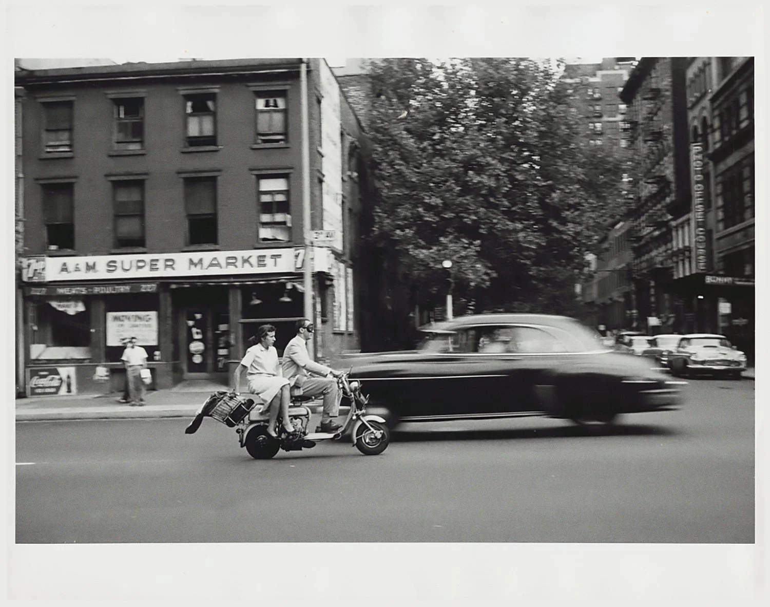
Tony Ray-Jones
A few years ago, working on the cover for the first edition of John Boughton’s Municipal Dreams, I had the pleasure of poring over RIBA’s collection of Tony Ray-Jones photos of 60s/70s United Kingdom. Ultimately we went in another direction, but I return to those pictures all the time. This one – Blackpool, 1969 – popped up on my feed the other day, and … wow.
Some books
Some recent book discoveries:
Everything All At Once: Postmodernity 1967–1992, Studio Yukiko’s dense and intense catalogue for the latest exhibition at the Bundeskunsthalle Museum. So big, they could only promote it by having a bodybuilder rip it apart. Apparently.
Similarly hefty and year-rangey: Thames & Hudson’s Comics (1964-2024), published to accompany the new exhibition at the Pompidou Centre, Paris, a survey of the international comic book landscape over the past sixty years.
Also – apologies for the bookshelf-burdening this week – this 334-page tome exploring Olivetti’s design heritage. So pretty. And while you’re cruising around the Present & Correct website, don’t miss these delightful 1950s Japanese matchbox labels or these 1960s postage labels that desperately need to be t-shirts.
TA-DA!
So the big news: I managed to escape to London for a day. Have to go down and refill the tanks every now and then. Thanks to some very intense and regimented planning, I managed to fit in a lot of art: the recently made-over National Portrait Gallery; the Deutsche Börse Photography Foundation Prize at the Photographers’ Gallery; the World Photography Awards at Somerset House; and Richard Serra’s six large drawings at David Zwirner. But the highlight of the day was this errant cardboard box that slowly and flamboyantly drifted down James Street to the delight of everyone.

In between all that frolicking about, I did manage to grab something to eat at the fantastic Lina Stores on Greek Street – sat next to Ruth Bloody Wilson. I was very cool about this, of course. I pushed the boundaries of nonchalance so far I think she actually ended up being starstruck by me.
Angel in New York
There’s still so much treasure to be found on Flickr (aka the social network that forgot to stop being), such as this collection of 60,000 images of New York scenes shot by Anthony Angel (1906-1967), bequeathed to the Library of Congress. SIXTY THOUSAND. And yet there only appear to be a couple of dozen here. Hopefully they get around to digitising some more.
Cover Meeting
“I’m into the idea of making stuff that doesn’t look like a book cover … something that doesn’t look like it fits perfectly in” – Steve Leard’s Cover Meeting podcast is back with a second season of talks with book cover designers, kicking off with one of my favourites, Jack Smyth, talking about working with art directors as a freelancer, the growing scourge of design-by-committee and why we don’t need more quotes on covers; followed by Sarah Wasley, Production Director and Design Director (aka “the bossy person that sets deadlines”) of Granta Books, on the importance of developing a thick skin by working in-house before going freelance, and how she collects freelancers like Pokémon.
Paris
I just managed to get two whole weeks off, so the three of us jetted off to Paris and it was LOVELY. A few highlights: Nathanaëlle Herbelin at the Musée d’Orsay; the Jean Julien installation at La Bon Marché; the Eiffel Tower (thanks to this one incredibly tip: when booking, set your computer’s clock to French time); hitting every single comic store on Rue Dante; and of course the open top bus tour. I love an open top bus tour.
I was less keen on seeing a duckling being eaten by a crow at the base of the Eiffel Tower. That was … not great. Fascinating seeing how in the blink of an eye it brought together onlookers from all corners of the world in a frenzy of despair and fruitless attempts to help. THANK YOU SYMBOLIC DUCKLING.
Lego x Kallax
Myself and the child were having a big LEGO sort yesterday and discovered something quite wonderful – the shelves/dividers of Ikea Kallax shelves are exactly two studs wide, and will hold a simple bracket shape unsupported. So many possibilities! Some pics of it in action here. Swedish/Danish cooperation at its finest.
Kyle T Webster
From this wonderful post by Kyle T. Webster on the AI-adjacent lie of creative privilege:
I continue to guard the mysterious and long-protected secrets of creative thinking, art-making, and storytelling that were passed down to me decades ago during my initiation ceremony (paddling and all) deep underground in the ancient Temple of Selfish Artists.
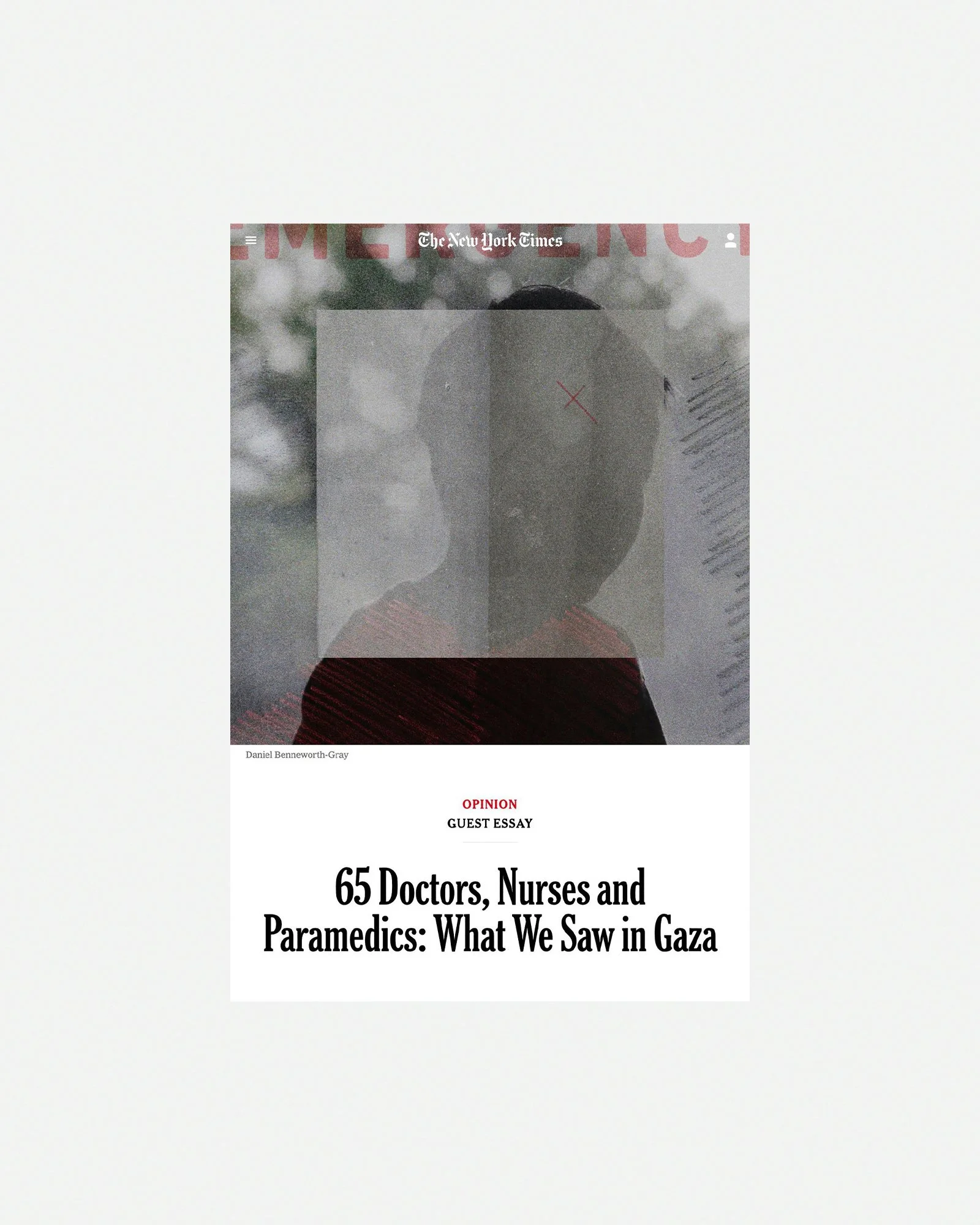
Blast
A new piece for the New York Times, illustrating an article on brain injuries caused by blast exposure and how artillery is essentially killing members of the military who don’t even see combat. Editorial work is such a different pace to book design – turnaround of one or two days rather than several months (or even years). It’s intense, but damn I love it.