New work for Bloomsbury – cover for Ed Simon’s Writing During the Apocalypse. We decided to use Destruction, from Thomas Cole’s The Course of Empire series. The real challenge was finding the best crop – every inch of the painting is full of drama, so many options. It involved a lot of L-shaped finger-framing.
Work

How Will Capitalism End?
I designed the new edition of Wolfgang Streeck’s How Will Capitalism End?, published by the wonderful folks at Verso. You know what they say – sometimes you just need a massive cube of ocean.

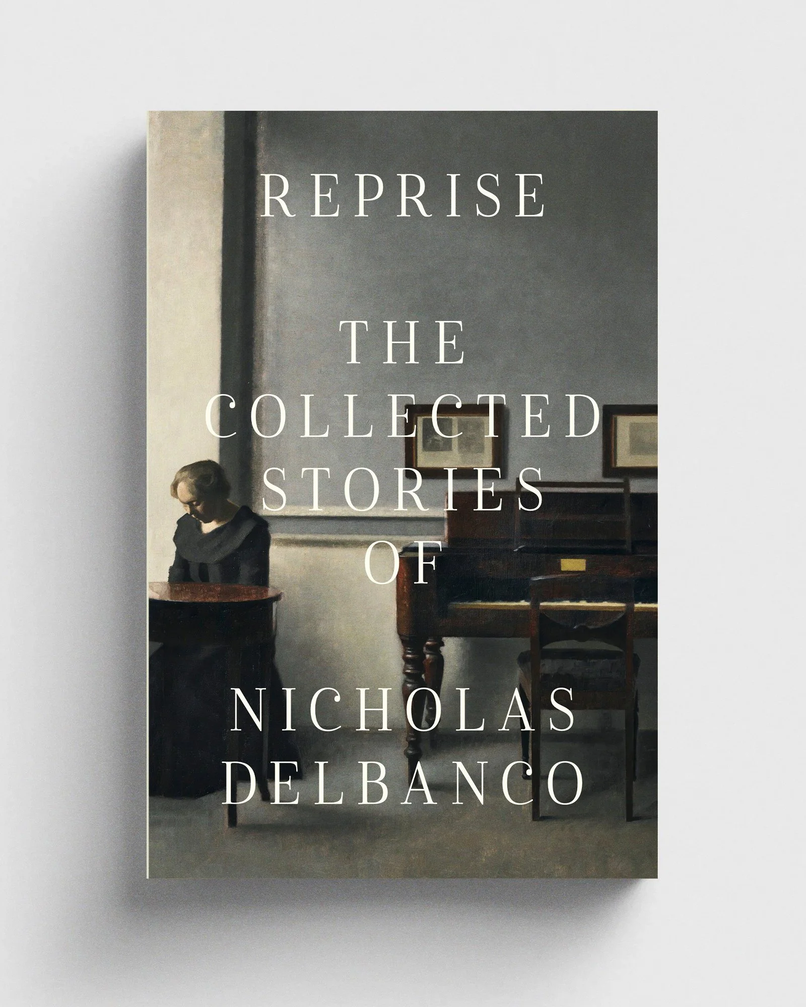
Reprise
New cover for Dalkey Archive Press – Reprise, collecting three volumes of short stories by Nicholas Delbanco. That’s Ida In An Interior With Piano by Danish painter Vilhelm Hammershøi and isn’t it lovely?
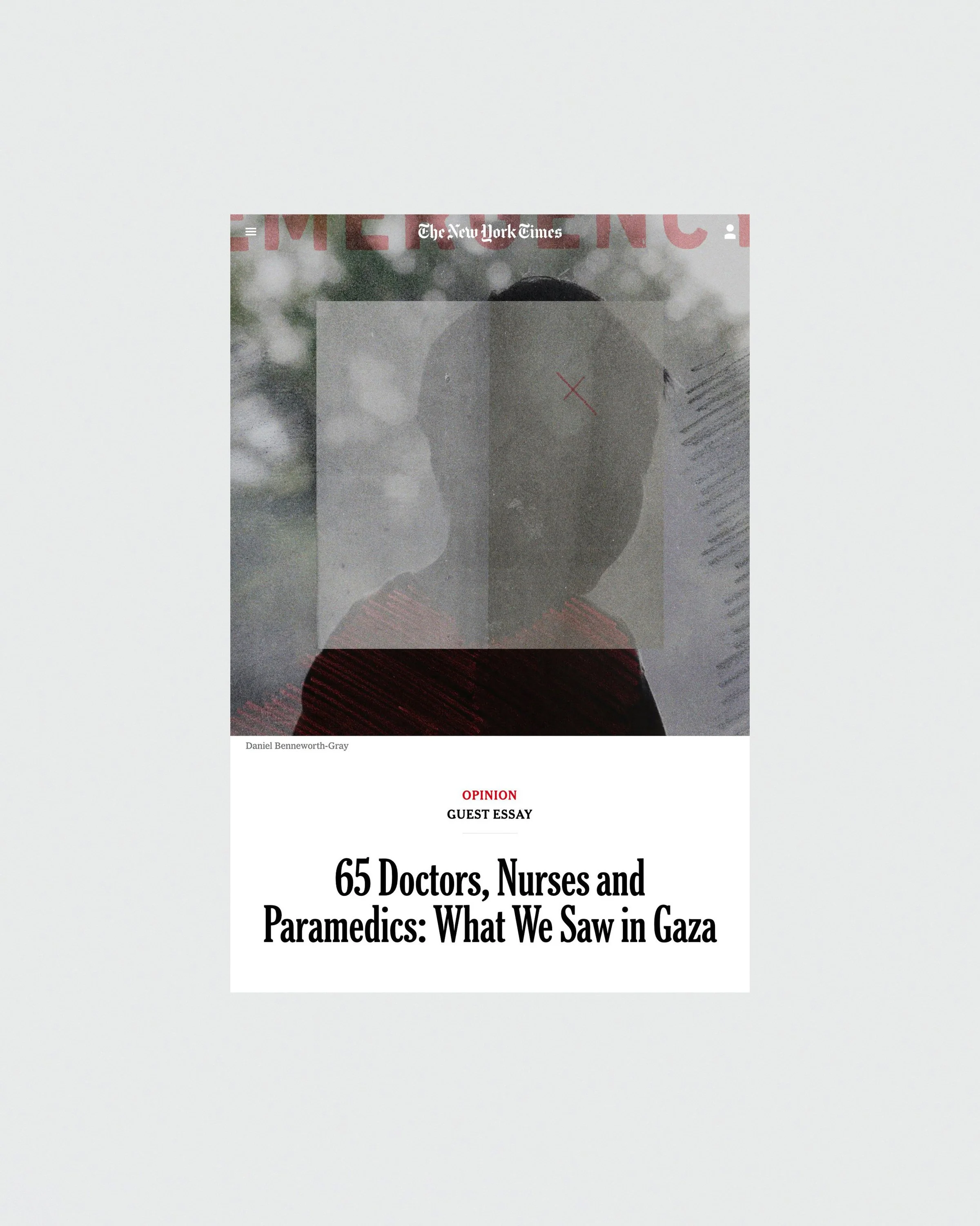
What we saw in Gaza
New work by yours truly for The New York Times, illustrating some pretty horrifying witness reports from doctors, nurses and paramedics in Gaza.
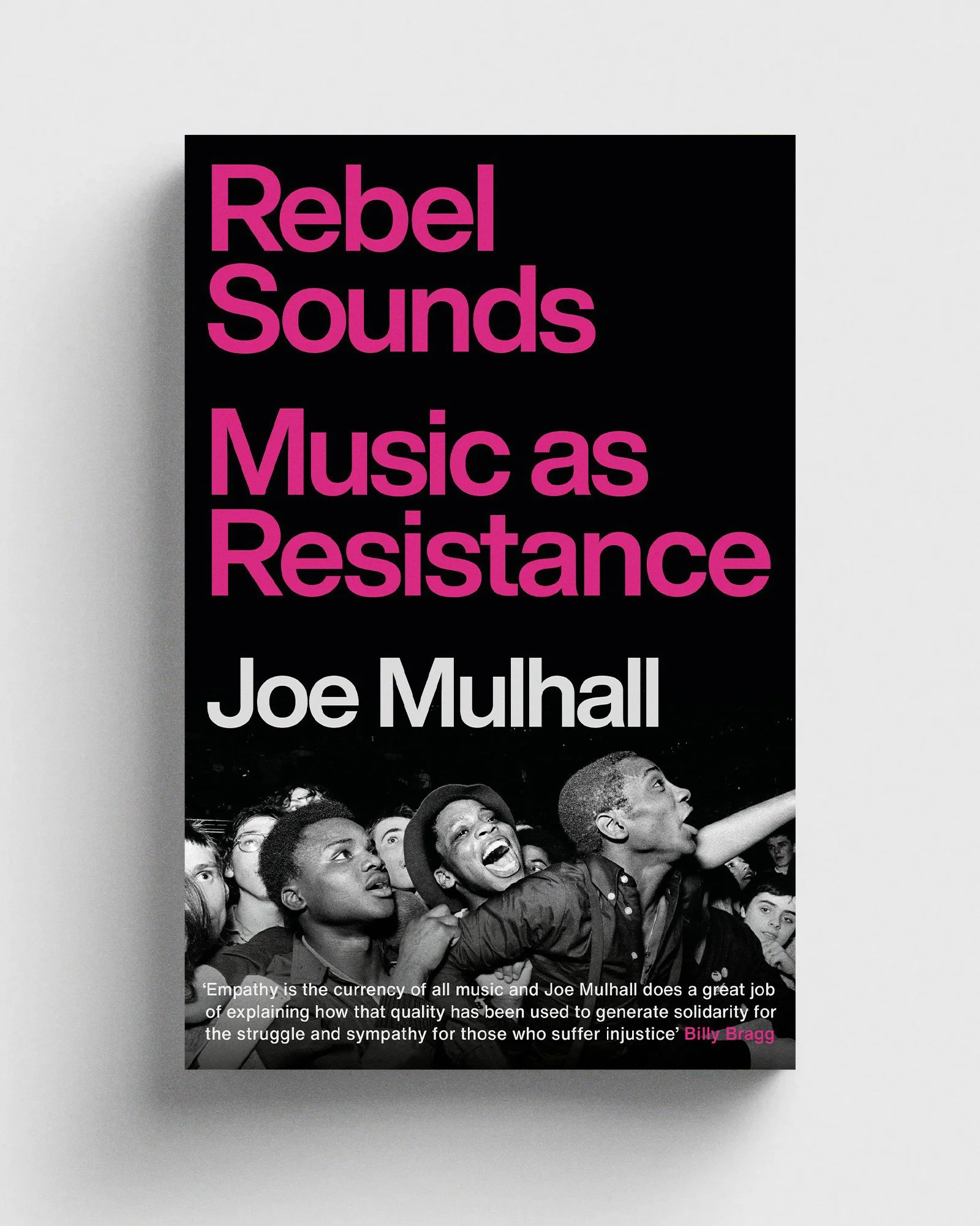
Rebel Sounds
An honour to have designed Joe Mulhall’s new book Rebel Sounds, coming from Footnote in September. Photograph of The Specials fans at Leeds Carnival in 1981, by the great Syd Shelton.
Blast
A new piece for the New York Times, illustrating an article on brain injuries caused by blast exposure and how artillery is essentially killing members of the military who don’t even see combat. Editorial work is such a different pace to book design – turnaround of one or two days rather than several months (or even years). It’s intense, but damn I love it.

The Fens
This cover for Head of Zeus was an absolute joy to work on, as I got to play around with Fred Ingrams’ incredible paintings of the Fens. Spoilt for choice, I put together a lot of options! Although it wasn’t the final cover, I reckon this one – featuring Fodder Beans, Cock Bank, Whittlesey – is my personal favourite. Just look at that colour.

Witch
Unused cover for Rebecca Tamás’ poetry collection Witch, published by Penned in the Margins. In case you were wondering, that’s a very tight crop of Love's Shadow by Frederick Sandys, 1867.

Don’t Look Now
I asked on twitter for film poster requests, and somebody suggested Nic Roeg’s Don’t Look Now, so this happened. Took an awful lots of willpower to not include an obvious splash of red in there somewhere.

Foucault in Warsaw
Recent cover for Open Letter’s new translation of Remigiusz Ryziński’s Foucault in Warsaw. Don’t look directly at it, lest it devour your soul. UPDATE: it’s been listed as one of the best covers of the year by AIGA Eye on Design, which is jolly nice.

The Thing
I decided what the world desperately needed this week was a new poster for The Thing, so I assigned myself the brief and put together the above. Lots of nice feedback, but still no telegram from Mr Carpenter. I can wait. In the meantime, I’ll throw myself at other films, see where this path takes me. Cinema + rectangles = the dream.

Creative Review
Further adventures in collage – illustration for my latest Creative Review column, on managing my work contacts. I’ve finally found a way to combine my two passions, spreadsheets and The Apartment.

A Reluctant Memoir
New work for Head of Zeus, covering Robert Ballagh’s A Reluctant Memoir. Had fun chopping up and reconfiguring the artist’s many self-portraits.

Gandhi: An Autobiography
Unused design for Penguin’s new edition of Gandhi’s autobiography, an exercise in minimal collage – is it collage if there’s only one element? This one was possibly a tad too quiet for the shelves of Waterstones, but I rather like it.

James Joyce
Cover for Harry Levin’s James Joyce, designed for the Berthold Wolpe exhibition at the Type Archive, part of Monotype’s launch of the Wolpe Collection of typefaces. I spent way too long mulling over whether or not this one needed an eyepatch over the O, but in the end I just let the Albertus Nova curly bracket do all the work.

Impressions of the Wilderness Children
So this happened. It came about because lovely copywriter chap Jon Ryder noticed some weird wording on a sign, and then equally lovely copywriter chap Jonny Cullen suggested it would make a good title for a horror movie (starring Jenny Agutter and Bernard Cribbins), and then original lovely copywriter chap Jon Ryder threw down the gauntlet for me to turn it into a cover (see twitter for the whole chain of events).

I don't normally do covers on request like this, but this immediately struck me as a damn fine excuse to play with the Marber grid and pay homage to one of my all-time favourite Penguin covers, Penelope Mortimer's The Pumpkin Eater. Making up old-style paperback covers is a pretty futile exercise in nostalgism (I resisted artificially ageing it with the usual dog-ears and rips) but it's also rather fun.