Further adventures in collage – illustration for my latest Creative Review column, on managing my work contacts. I’ve finally found a way to combine my two passions, spreadsheets and The Apartment.

Collage
I've spent an unsavoury chunk of this year unable to loiter in the book shops and charity shops of York; my eyes and fingers starved of the vital printed inspiration that feeds my own work. Frustrated, I've redirected this attention towards my own bookshelves, revisiting a personal library too often taken for granted. Unfortunately, reading and looking isn't enough for all that pent-up poring-over energy. No, I've taken to cutting things up.
Restlessly keen to pounce upon any passing creative bandwagon, I've found myself working the recent resurgence of collage into my book design. I've been cutting and pasting for real for a change and it's incredibly satisfying. If a little destructive.
I'm enjoying getting back in touch with material. I design physical products, but my part in the process usually takes place entirely under glass. Sometimes I don't get to actually feel my work until months later. And it's an odd thing to complain about, but working on screen, one is spoilt by too much power; everything can be changed, everything can be undone. There are no limits. I feel like a drone pilot attacking an image from afar with complete impunity, rather than getting up close and working with it.
With collage, the joy comes with sourcing and selecting the material; tackling the constraints and the qualities of the material; being steered in an unexpected direction by the size or quality or texture of the images you've found. Finding new contexts and juxtapositions for images divorced of meaning. You have to make decisions and you have to commit to them. It all feels so much more definite.
Delving deeper and messilier into this medium, I've discovered practical considerations that I'd always taken for granted. A shameless banal inquisitor, my instincts drive me to hunt down and pester my favourite collagists to get some insight into their techniques. Where do you source materials? How do you organise them? Do you use scissors or a knife? What form of adhesive do you use? Do you work entirely by hand, or do you finish off digitally? Do you photograph or scan the finished piece? (It turns out his is a particularly big one, as the same piece of work can look enormously different depending upon how you finally capture it.)
Fortunately, this interrogation has mostly been done for me thanks to recent collections of contemporary collage artists, such as DR. ME's Cut That Out and Rebeka Elizegi's Collage by Women, joining various other monographs and collections on my bookshelves. Part of the enjoyment of wandering down a new creative path is the study of it – while I litter my desk with shards of paper and my fingers with paper cuts, I'm learning about a whole new world.
So why is collage having a moment? Is it a response to to the proliferation of digital forms? An embrace of the opening up of public access archives, ripe for plundering? A technique that lends itself to social media's creation-as-performance environment? The natural resting state of twenty-first century's fragmented culture? Or is it popular with art directors right now simply because … it's popular with art directors right now? Probably all of the above, plus a hundred other reasons.
The big question for me: how do I resist cannibalising these books? Is there a limit to collaging collages of collages? No, before I make any more cuts, I must amass some new old source material. Those shops are calling me. I want some books that I don't want so that I can destroy them and make books with them and … I really need to get out more.
CR40
Creative Review is 40! Lots of retrospective treats to dip into, including: an oral history from previous editors; 40 creative moments that changed culture; my hazy memories of taking over the magazine’s twitter account; and a lovely new cover from Annie Atkins.
High School High
You can’t beat an ultra-specific instagram account – one of my favourites is High School High, Veronica Kraus' collection of old high school yearbooks. Borne out of printing constraints, budgets, experimentation and good old-fashioned playfulness, there’s a wild charm to these designs. The naiveté-gusto of 1970s high school year book committee kids is a design force to be reckoned with; just pure unfiltered, unsullied teenage creativity. Grids be damned, this stuff is always a refreshing kick up the bum if you’re stuck on a job.
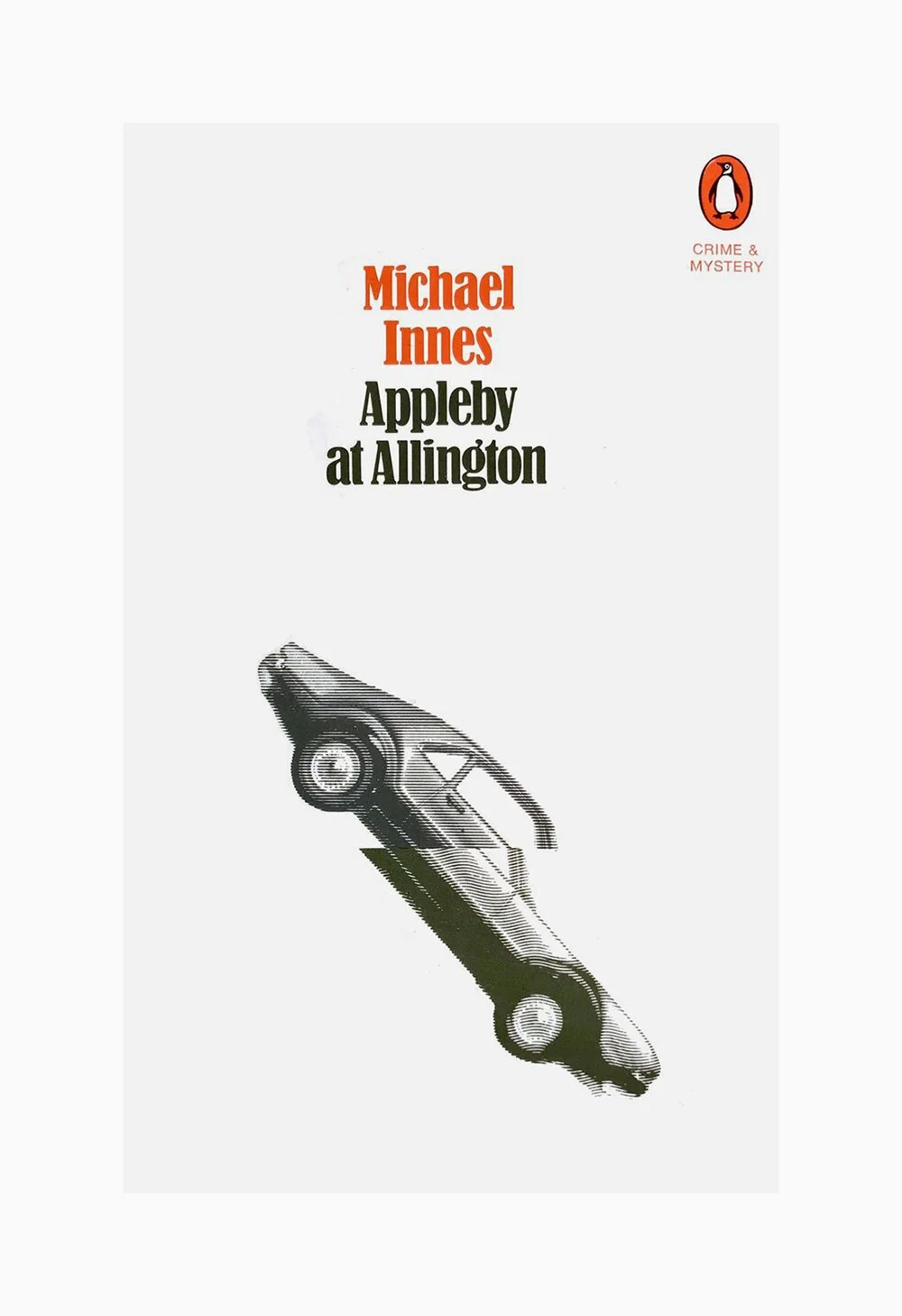
Appleby at Allington
Appleby at Allington by Michael Innes, designed by Crosby/Fletcher/Forbes in 1970. Quite possibly my favourite book cover of all time. It’s just perfect. At least I assume it is – despite taking pride of place on my bookshelves, I’ve never actually read it, so for all know it’s completely off. Still, what better way to judge a book than by its cover, right?
A Thief in the Night
A Thief in the Night cover designed by Tony Palladino, 1962. Discovered via Greg D’Onofrio and Steven Heller’s The Moderns, one of my absolute favourite design books. Lots more Palladino to be found in the Milton Glaser Design Study Center and Archives.

Walter Benjamin’s Writing Tips
I’m working on the cover for a book about philosopher Walter Benjamin, perhaps best known for The Work of Art in the Age of Mechanical Reproduction (the most recent edition impeccably designed by David Pearson for Penguin’s Great Ideas series). Amongst the rest of my research, I came across his Writer's Technique in Thirteen Theses, from the 1928 book One-Way Street:
-
Anyone intending to embark on a major work should be lenient with himself and, having completed a stint, deny himself nothing that will not prejudice the next.
-
Talk about what you have written, by all means, but do not read from it while the work is in progress. Every gratification procured in this way will slacken your tempo. If this regime is followed, the growing desire to communicate will become in the end a motor for completion.
-
In your working conditions avoid everyday mediocrity. Semi-relaxation, to a background of insipid sounds, is degrading. On the other hand, accompaniment by an etude or a cacophony of voices can become as significant for work as the perceptible silence of the night. If the latter sharpens the inner ear, the former acts as a touchstone for a diction ample enough to bury even the most wayward sounds.
-
Avoid haphazard writing materials. A pedantic adherence to certain papers, pens, inks is beneficial. No luxury, but an abundance of these utensils is indispensable.
-
Let no thought pass incognito, and keep your notebook as strictly as the authorities keep their register of aliens.
-
Keep your pen aloof from inspiration, which it will then attract with magnetic power. The more circumspectly you delay writing down an idea, the more maturely developed it will be on surrendering itself. Speech conquers thought, but writing commands it.
-
Never stop writing because you have run out of ideas. Literary honour requires that one break off only at an appointed moment (a mealtime, a meeting) or at the end of the work.
-
Fill the lacunae of inspiration by tidily copying out what is already written. Intuition will awaken in the process.
-
Nulla dies sine linea ['No day without a line'] — but there may well be weeks.
-
Consider no work perfect over which you have not once sat from evening to broad daylight.
-
Do not write the conclusion of a work in your familiar study. You would not find the necessary courage there.
-
Stages of composition: idea — style — writing. The value of the fair copy is that in producing it you confine attention to calligraphy. The idea kills inspiration, style fetters the idea, writing pays off style.
-
The work is the death mask of its conception.
It occurs to me that most of these could be applied to designing as well as writing. I particularly like the thought of an idea as an alien … for whom you’re making a death mask … or something. Hang on, let me read it again.
Own Brand
I’ve finally got my hands on Own Label by Jonny Trunk, a look at the work of Sainsbury’s in-house design studio from the sixties and seventies. And it’s just lovely. There’s a lot of incredible design in there – and on the rather impressive Sainsbury’s Archive site – but it’s the typography-and-geometry stuff that really grabs me. The shelf-stacking, trolley-shepherding me from twenty-five years ago would find this fascination very strange indeed.
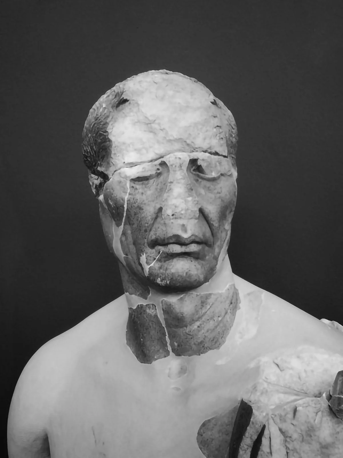
Jenny Theolin
Love this photograph by Jenny Theolin of a 2,500 year-old sculpture found on Delos. Not sure who he is or why he looks like that – a little bit Bacon, a little bit Voldemort – but I’ve had him on my desktop for several weeks now, a kind of memento mori.
Neil Gaiman
In May 2012, Neil Gaiman delivered the commencement address at Philadelphia's University of the Arts, sharing thoughts on creativity, bravery, and strength. As the world goes through one big communal tough time, these words spring to mind:
When things get tough, this is what you should do: Make good art. I’m serious. Husband runs off with a politician — make good art. Leg crushed and then eaten by a mutated boa constrictor — make good art. IRS on your trail — make good art. Cat exploded — make good art. Someone on the Internet thinks what you’re doing is stupid or evil or it’s all been done before — make good art. Probably things will work out somehow, eventually time will take the sting away, and that doesn’t even matter. Do what only you can do best: Make good art. Make it on the bad days, make it on the good days, too.
The whole speech is available in Gaiman’s Make Good Art, a lovely little book (designed by Chip Kidd) full of big wisdom.
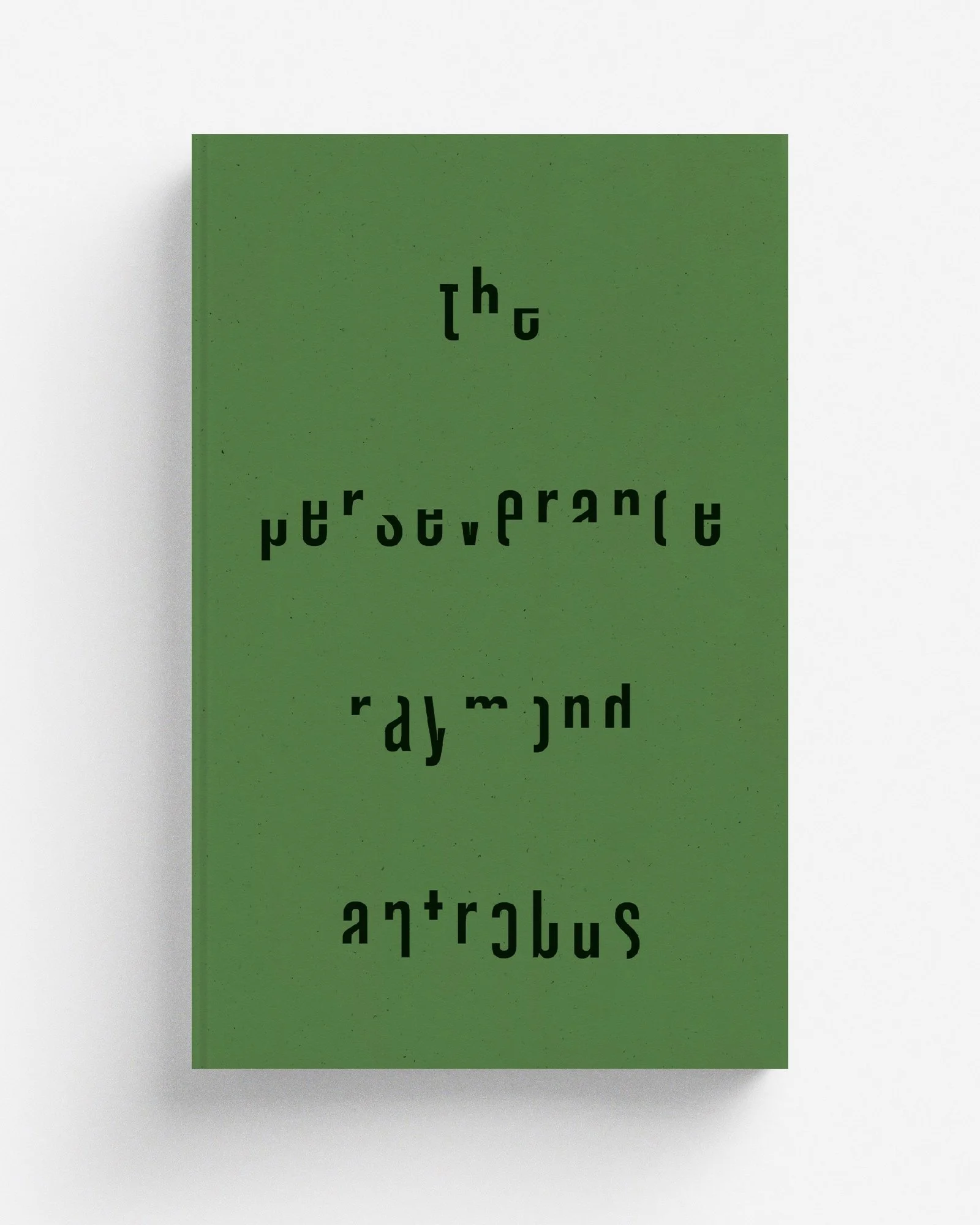
The Perseverance
An unused design for Raymond Antrobus’ incredible poetry collection, The Perseverance. A particular favourite simply for the creative process. After the initial plonking and fiddling of text on the page, the words guided my hand and arranged themselves into a suggestion of a head-torso silhouette; chipping away at the letterforms, a more organic shape emerged and … well I rather like the result! Or maybe you see none of that and you have no idea what I’m blathering on about – it’s a kind of Rorschach thing.
Shatterhand
So I decided to start the year by breaking myself. At the end of a rare week off, I thought the family could do with one last hurrah of festive merriment together – ice skating! What could possibly go wrong with a few gentle laps of the rink? I could teach the boy a thing or two with my amazing pirouetting skills!
Cut to one hour later and I'm sat in A&E, cradling a broken wrist and bruised ego, feeling thoroughly sorry for myself. Ten minutes in the waiting area – just enough time to flick through a battered 2014 issue of Horse & Hound – and I go straight in to see the doctor.
Following a quick dose of gamma radiation, he shows me my x-ray, pointing out an embarrassingly small chip of bone floating about in the grey mass of hand; insignificant enough that he has to draw a circle around it in case I can't see it (I can't see it). As I explain my graceless escapade, he chuckles along – oh what japes! – and then launches into the small talk, asking about my day job. I'm not great at explaining how/where/why I work at the best of times, so just I mutter some vague self-deprecations and say penguin a lot.
I feel a bit silly talking about my relatively insignificant profession – he mends lives while I drag words and pictures around a rectangle – but he laps it up, apparently fascinated by the ins and outs of book design. Okay, always good to meet a fan, maybe I should get my phone out and talk him through my portfolio and … oh I get it. He's nodding along, politely feigning interest and maintaining conversation to distract me from the fact he's yanking my wrist every which way. As he smilingly contorts me into various agonising positions (some of which I'm not sure were even possible pre-accident and are possibly some kind of deliberate karmic punishment), he continues asking me about my craft.
What he doesn't say, but is almost certainly thinking: You have the bone density of a sparrow. Maybe leave your desk once in a while and do some proper exercise, not just the occasional attempt at a triple axel after watching I, Tonya one time. Frankly I'm amazed you're not shattered all over. Spend five minutes with Joe Wicks every now and then at the very least. Please.
And: You'll have to carry on without the safety net of sick pay. And you don't have income protection for this sort of incident, do you? You were just blithely going along, assuming you could spend your entire professional life without incident, weren't you? The welfare of your family depends entirely upon you being able to push a little arrow around on your computer for money, but apparently that's less important than making sure you're financially covered in case your Playstation breaks down. Food gathered in Red Dead Redemption will not feed you, DO YOU KNOW THIS?
Furthermore: What if some random pandemic completely knocks the work off your desk and clogs the hospitals indefinitely? Will this careless injury be dealt with as efficiently? Will I want to be dealing with your latest pratfall? Your livelihood depends upon you NOT BEING HERE WITH ME. Why aren't you prepared for this, funny little book man?
He makes some good unspoken points. I leave with a pathetic latex thing wrapped around my wrist, a new feeling of professional precariousness hanging over me. For the next couple of months I'm a painkiller-addled left-handed designer. I'll cope. As long as the rest of the year goes without incident, I'll be fine.
Rediscovering 2000AD
A few weeks ago, director Duncan Jones tweeted some tantalising tidbit about his planned Rogue Trooper adaptation. Within seconds I was throwing my details at 2000AD's subscription page and just like that, comics have fallen back into my life.
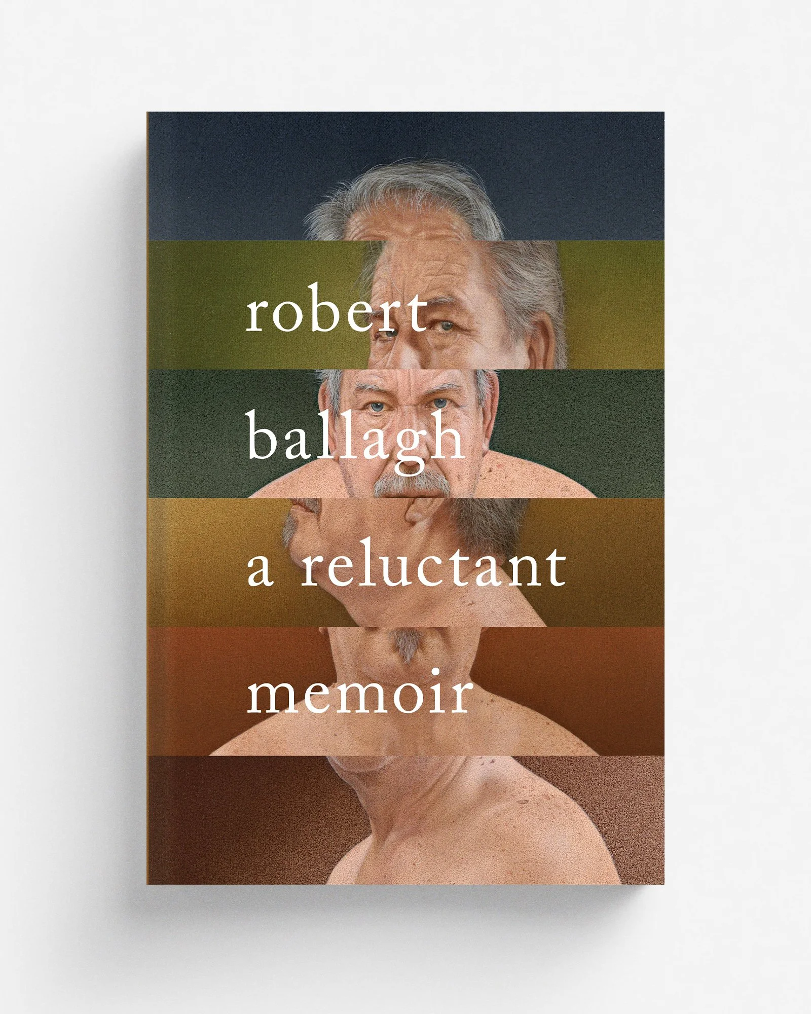
Read MoreA Reluctant Memoir
New work for Head of Zeus, covering Robert Ballagh’s A Reluctant Memoir. Had fun chopping up and reconfiguring the artist’s many self-portraits.
Perfection
“The maxim ‘Nothing avails but perfection’ may be spelt shorter: PARALYSIS.”
— Winston Churchill
“The perfect is the enemy of the good.”
— Voltaire
Sorry, couldn't decide which quote to open with. Both are equally good … sure, Churchill is a marginally more contemporary voice … but Voltaire has a bit more umph … of course the context of Churchill's quote may be more relevant (a message to landing craft designers who were wasting too much time arguing over details) … but I like the black and white, good versus evil imagery of Voltaire … now I think about it, actually there may be an Aesop quote that's more appropriate … or perhaps …
This is how I spend my days, in a state of constant indecision. The debilitating belief that all options but one are incorrect could generously be called perfectionism, but a more accurate term would be option paralysis – the tendency, when given unlimited choices, to make none. An interminable mull over whatever trivial options lay before me, every action bogged down by a fear of choosing unwisely – what to write, what to wear, what to watch, what to eat (my sincere apologies to anyone who has ever sat with me at a sushi conveyor belt), what to anything.
At some point, no idea how, I managed to make the decision to be a designer, a profession that revolves entirely around making decisisions. Every new brief brings a fresh blank rectangle, waiting to be filled with my astute selections. Type, colour, image – I'm paid to choose. A thousand preferences and variables wrung from my mind, and they all have to be perfect. The more minimal the design, the more glaring the non-perfection – nowhere to hide in all that damned white space. Once the precise shade of white has been chosen, that is.
Just getting the title onto the page is like wading through a mental swamp – I might narrow my typeface selection down to a few possibilities from that endless drop-down list (having agonised over which typeface selection method to use) and then … I stare at them. One of them must be the one, must be right.
Which is probably wrong. Every little fork in the road threatens to bring my work to a complete standstill, all because of some irrational belief that every molecule of the universe should be arranged to some ideal, unknown pattern. Perfection leads to indecision, indecision leads to procrastination, procrastination leads to cat GIFs. Perhaps perfect is the enemy.
Of course, perfection is just an excuse, an admission of defeat at the daunting multitude of possibilities and variables available to me. Design shouldn't be about scrolling up and down lists. Perhaps this is why I find myself drawn to self-imposed constraints, like Massimo Vignelli's "a few basic typefaces" ethos or Jenny Volvovski's From Cover to Cover project, in which she redesigned dozens of strictly green/Futura/Caslon Italicised book jackets. Can paralysis be bypassed by having all of those decisions already made? Maybe. Probably. Of course, to reach this point, first I'd have to come up with my particular set of constraints.
Besides, the paralysis only lasts so long. Once decisions start being made – usually once the white has been killed, the fear of the blank page overcome – the ball starts rolling and real design starts happening. And then it reaches a momentous point in the project where I am the one presenting the options to somebody else; the client takes on the burden of selection. Three or four ideas will be sent out into the world to fend for themselves. Not yet perfect, but perfectly good. I reckon Voltaire will do just fine.
Hyperlinks
A bundle of hyperlinks cluttering up my tabs:
The story behind the 20,000-brick Lego city that Norman Mailer built in his apartment for the cover of Cannibals and Christians. Warning: contains the words “glue them”.
How Chad Danieley created Joker’s gritty logo with wood type letterpress.
Fascinating insight into the digital-physical processes of Jeffrey Alan Love, one of my favourite illustrators working today. Involves more sock than expected.
Björk meets Arvo Pärt and other groundbreaking experimental musicians in 1997 documentary, Modern Minimalists.
“I’m reminded of Rob in High Fidelity, sentimentally sorting records autobiographically” – spring cleaning your font library can be an unexpected opportunity to get all nostalgic. My latest for Creative Review.
Fantastic collection of American Type Founders catalogues and specimens. Mostly mid-century, but some much older. A particularly nice array of borders, symbols and other typographic accessories.
The Casual Optimist – aka book design maven Daniel Wagstaff – looks back at his favourite covers from the last ten years. In summary: it’s been a great decade for books.
Elizabeth Goodspeed’s list of open access archives, historical ephemera and found materials is a fantastic resource, well worth plundering.
The impossible logos of Roger Ferriter, perhaps best known for the L’eggs branding. An ongoing exploration in three dimensionality and impossible objects.
Gandhi: An Autobiography
Unused design for Penguin’s new edition of Gandhi’s autobiography, an exercise in minimal collage – is it collage if there’s only one element? This one was possibly a tad too quiet for the shelves of Waterstones, but I rather like it.

Learning synths
The design of this Learning Synths website from expert synthesizists Ableton is quite something, and you’ll soon be referring to yourself a radiophonic workshop. Warning: as I discovered within minutes of keeping and blooping, the dogs in your neighbourhood will not be best pleased.
Matchbloc
Fabulous to see a reprint of Matchbloc, Jane McDevitt and Neal Whittington's book of Eastern European matchbox labels. And oh my the posters! Expect to see a lot of these in the background of interior decorating photoshoots.
100 Best Books of the 21st Century
Perusing the Guardian’s 100 best books of the 21st century list, I was appalled at how few I’d actually read (including some I’d bought and gave away before getting around to). Stealing the shape of this post from Jason Kottke, who has made his own selection, here are the books I’m clearing well-intentioned shelf space for.
Read More