I’m in that London you hear so much about (you know, the one off the telly) and I’ve got time to kill before I have to return to York. I think I might get lost. I came down to catch up with a client. The meeting went better than expected – there were sandwiches and I didn’t break anything.
Read MoreTypeset in the Future
I spent my Sunday nose-deep in Dave Addey’s excellent book Typeset in the Future, all about type in science fiction (based upon his blog of the same name). Rather than a dry “this one is Futura, this one is Univers” catalogue of observations, Addey explores the cinematic and societal context around the type, while effortlessly managing the tricky task of steering the text back to the matter at hand. I particularly like his swift dismissal of the much-discussed, monolithic final section of 2001: A Space Odyssey – “this act contains no typography and is therefore of no concern to us”.
Gary Hustwit
“The chances of me discovering a new land mass in the South Pacific is very slim, but making the connection between an obscure designer, musician, architect or photographer – and how their work relates to modern life – is what drives me”. From punk to Bauhaus – a Great interview with filmmaker Gary Hustwit (Helvetica, Objectified, Rams) from the second issue of Vitsœ Voice. Yes it’s a brochure-zine that really wants to sell you some shelves, but it’s really nicely put together and well worth getting your hands on if they still have any copies.
Spin the Black Circle
There’s a theory that recorded voices can be drawn from tiny irregularities in the surface of ancient ceramic vases, having picked up vibrations while their clay was still fresh; like grooves laid in vinyl. It’s probably a load of baloney, but it’s a nice idea. Along those lines, I’d like to think that each of my projects has a bit of music in it; the rhythms of the grid subconsciously translated from whatever I was listening to when I worked on it.
Read MoreFilms watched, June 2017
Here's last month's slew of cinematic happenings, including Wonder Woman, Suicide Squad, Hop, Tangled, Moneyball and Baby Driver.
Read MoreCity Building Education
Wonderful short film from 1971, following Doreen Nelson and her brother, architect Frank Gehry, as they test out an architecture-based curriculum on Los Angeles school children, where they’re set the task of designing their own city. If you know any teachers, send them this link at once.
Andrzej Pagowski
Lots to be said about the second season of Killing Eve (especially the stunning locations and costumes), but what really caught my eye were the various Eastern European film posters decorating Eve and Niko’s house. Two of them, After Hours and Working Girl, are by Andrzej Pagowski, a Polish artist who specialises in a particularly nightmarish line of portraiture, somewhere between Bacon and Giger. Posteritati have a great selection of his work for sale, but be warned, this look may cost you dearly.
Zen in the Art of Writing
Austin Kleon on planting the seeds of ideas with nothing but pick-and-mixed words. Features this lovely quote from Ray Bradbury’s Zen in the Art of Writing:
These lists were the provocations, finally, that caused my better stuff to surface. I was feeling my way toward something honest, hidden under the trapdoor on the top of my skull … I was beginning to see a pattern in the list, in these words that I had simply flung forth on paper, trusting my subconscious to give bread, as it were, to the birds.
Won’t you open that trapdoor.
Nothing
I have nothing on my mind. Not nothing-nothing, you understand, but nothing. This was the subject of a book I worked on recently: the concept of nothing, the value of nothing, the significance and interpretation of an absence of … thing. Weird and fascinating texts written by intimidatingly clever people cross my desk all the time, but this one was a bit special. I’ll let you in on a little publishing industry secret: most books are, by and large, about something. Something is the designer’s friend. You know where you are with something. Nothing, now that’s a rare visitor. What does it want? Where do you put it? What does it look like?
There is, of course, one very obvious answer. Not that it was obviously obvious to me at the time. After an awful lot of staring at a blank page, I got there eventually: nothing looks like nothing. This was the beginning of a half-formed, sort-of idea. And then I came across Peter Mendelsund’s What We See When We Read blog, documenting in generous detail the creative process behind his work on Italo Calvino’s backlist. Apparently he’s had nothing on his mind too, highlighting this pertinent quote from Calvino’s The Arrow in the Mind:
Is the blank also a colour? The blank is the colour of the mind. The mind has a colour that we never see because some other colour always passes through our minds and superimposes itself on our gaze.
The colour of the mind. Who could resist having a stab at that? Subscribing to the Adamantian philosophy that under no circumstances should you fear ridicule, one of the cover concepts that I pitched to my client was blank. No title, no author, no fake stickers. Simply nothing (see above).
It was swiftly, politely, justifiably rejected. This wasn’t a massive surprise – it was always going to be a bit of a long shot. Somewhere between apt and unmarketable, it was one of those ideas that would either hit the brief squarely on the head or hit a wall. To the wall it went. But it’s still on my mind, and now I’m questioning all of my assumptions about nothingness in book design and what a cover should or shouldn’t be. As with any physical format awkwardly adjusting to the digital world, it’s impossible to pin down quite how books are supposed to behave from one day to the next – into this void of uncertainty, devilish advocacy spills from my mind …
Such as:
Why not nothing? Does a book’s cover really need to have anything on it? Displayed for sale online, all of the pertinent details are typically displayed next to it. It’s nice to have the title and author and all that word-jazz on there, but it’s no longer essential. The cover can be relieved of its duties, free to become a blank canvas for a more expressionist interpretation of the text.
And:
Here in the real world, on the shelf of a library or shop, isn’t the spine more important than the cover anyway? Why do we never talk about spines? Do spines not deserve our love?
Also:
Designers are breaking and remaking the visual language of books all the time. Text is removed, reshaped, redacted. At what point does the unconventional become the conventional? (After a lot of confusion, apparently. There are reports of readers who scratched away the overprinted blackness of David Pearson’s fantastic Nineteen Eighty-Four cover to get to the title, the deliberate obfuscation interpreted as a challenge to emancipate the norm. Dave Eggers’ You Shall Know Our Velocity! had the opposite problem: too much text. The story starts right there on the front and continues on the endpaper, denying the reader that usual initial breathing space. Whole shipments were returned as faulty.)
Of course, the music industry answered all of these questions long ago, going through its own revolution of design abstraction. Record sleeves constantly disrupt conventions and expectations. One example springs to mind, a sleeve that shares very subtle design nuances with my own book cover: The Beatles’ White Album. Nothing but a square of nothing. It is the apotheosis of blankness …
Except that it isn’t blank any more. Artist Rutherford Chang recently collected hundreds of copies for his We Buy White Albums project, and not a single one is immaculate. Each is marked with unique discolourations, stains, rips, stickers and vandalisms. Seen together, they display the incredible diversity that identical nothings can attain over five decades. Time reveals the colour of the mind. Nothing is merely a vacuum, to eventually be occupied by a million somethings.
Week RIP
Remember Week? I liked Week. Week made sense. I appreciated how Week was neatly divided into a cycle of manageable chunks; five for work, two for cartoons and jigsaws. The UI of Week was a bit skewiff – fashioned from a hotchpotch of Norse mythology, Judeo-Christian DIY habits, pagan leftovers, Roman gods and planetary orbits – but it mostly worked. Week provided the comfort of repetition. You knew where you were with Week.
Read MoreVirginia Woolf on the Cultivation of Taste
“It would be foolish … to pretend that the second part of reading, to judge, to compare, is as simple as the first — to open the mind wide to the fast flocking of innumerable impressions. To continue reading without the book before you, to hold one shadow-shape against another, to have read widely enough and with enough understanding to make such comparisons alive and illuminating — that is difficult; it is still more difficult to press further and to say, ‘Not only is the book of this sort, but it is of this value; here it fails; here it succeeds; this is bad; that is good.’”
Read MoreFilms
Here's everything I watched in May, on small screen and large. For further discussion, all links lead to the corresponding bit of my Letterboxd profile. And yes, I did pinch this monthly movie missive idea from Khoi Vinh.
- The Silence of the Lambs. Still incredible. If you can't afford film school, just buy this and watch it every day for a month. You will learn a LOT
- Prometheus. Thought it might be a good idea to watch this again before seeing Alien: Covenant. It wasn't.
- The Guardians of the Galaxy Vol. 2. Lots of good stuff, lots of bloat. I never thought I'd say this about anything, but Michael Rooker is the star here.
- Moana. So many times. Is it as good as Tangled? Quite possibly.
- Margin Call. I'd heard good things about this for a while, but never quite found myself in the "ooh, I'll watch a low budget banking drama" state of mind. And then it appeared on iPlayer and I gave it a shot – and oh boy, it's good. Highly recommended.
- Alien: Covenant. Such high hopes, but despite the title, this is more of a Prometheus film than an Alien one. And it weirdly has the same boring core as Guardians.
- Coherence. Made for approximately five quid, and all the better for it.
- I Origins. Really wasn't sure about this one right up until the last scene, and then it completely broke me (partly because of a beautiful bit of Radiohead). Raises some big questions about science and faith – it's a great late night discussion-starter.
- The One I Love. A three minute short film dragged all the way out to a feature. Shot at Ted Danson's house apparently, so maybe worth watching if you like a spot of Through the Keyhole. Rooney Mara is credited as costume designer, which is utterly preposterous for a film that features a frock and a couple of shirts.
- Wild at Heart. Back when Cage was Good Weird rather than Bad Weird, and Dern was approximately 8 feet tall and had to hold her hair in place for entire movies. Vastly superior in every way to the embarrassingly poor new season of Twin Peaks.
- WALL-E. Brilliant, obviously. Not sure why exactly, but I have a feeling that this would make a cracking double bill with La La Land.
- Rogue One. Second time around and … nope, still doesn't work for me. Mostly down to the unlikeable characters, the unnecessarily convoluted plot and the weird no-loose-ends third act.
- Tangled. Love it love it love it. Straddles so many genres, and wins them all. Those celebrating the fact that Wonder Woman is the first successful female-led superhero movie clearly haven't seen this. Or Moana. Or Frozen.
- Nightcrawler. Dr B didn't like this at all, but I rather liked the cynical, sleazy, Taxi Driver-ish feel to it – but you do need to have a shower or two afterwards.
- La La Land. Still utterly adorable, but it loses a lot on the small screen. As with any film about films, this demands to be seen on the biggest, brightest screen possible.
- Solace. A fine, forgettable little thriller. Notable for apparently being written as a sequel to Seven.
- Hop. Surprisingly inoffensive, and stands up to repeat viewings with the boy. Basically the Easter equivalent of Arthur Christmas. Russell Brand is really rather good – and surprisingly tolerable – as a voiceover actor, and James Mars den continues to be one of Hollywood's most underrated talents.
Colour
The other day, listening to a recent episode of North v South, Jonathan Elliman and Rob Turpin’s banterful design podcast, I found myself fervently nodding along to a particular subject of conversation. Turpin made an admission that sounded all too familiar:
I don’t understand why people seem to see so much more colour than me. To me, the grass is green. Maybe two or three shades of green. But some people innately have this ability to see another spectrum of colour – they’ll paint a self-portrait and it’ll be purples and greens and deep ochres. I’ll paint a self portrait and it’ll be … pink. Can they see more colour than me? Is there something psychological that prevents me from recognising or expressing those colours?
So it isn’t just me! I don’t think I’ve ever heard another designer address this so directly before: colour is hard. For some of us, anyway. It’s like an alien language – but it’s such a huge element of design, it feels stupid to admit that you’re not fluent in it.
Until now, I’ve successfully repressed my colourful struggles. I learnt my trade working in-house on a very tight budget, keeping printing costs down by sticking to two colours. Ever since then, black-and-another has been my default palette. It looks good, it works. Over time, I convinced myself that this is a considered stylistic decision, like I’m upholding a minimalist ideal of some kind. But if I step out of the safety of this routine and try something a bit more colourful, the truth soon becomes apparent. Colour hates me. Everything ends up looking like one of those colour-changing jumpers from the 90s that’s been put in the wrong wash.
(As a seasoned second colour picker, there is one indisputable fact I have learnt about colour: for some reason, the most satisfying ones are those that straddle two and avoid simple definition. Is it yellow? Or orange? Yellowy-orange? Gold? Rule of thumb: if you’ve chosen a colour that causes a morning’s worth of semantic confusion between you and your client, it’s a winner.)
Maybe it’s time to re-educate myself about this most basic element of my craft. I have to resist the pragmatism/complacency of my two-colour habit and recalibrate my eyes; teach myself to understand this broader spectrum that others are apparently privy to.
As with all problems in life, I’ve decided the best way to tackle this is to make a nice stack of handsomely-jacketed books on the subject. Josef Albers’ Interaction of Color is pretty much the gospel on how to use (if not spell) colour; Kassia St Clair’s The Secret Lives of Colour explores the fascinating history and meaning behind different shades and pigments (personal favourite: Mummy Brown, literally made from ground mummies); and the recently reissued Paul Rand: A Designer’s Art is a masterclass in designing with colour. These should keep me busy for a while.
Plus, I’m fortunate enough to share studio space with an expert on these matters, intent on surrounding me with an abundance of colourful things to inspire me and/or step on. He’s only four, but I think he knows what he’s doing. I asked him if he’s deliberately instigated an osmotic process that will systematically alter my brain chemistry thus ridding me of the Hypercolor fugue of chromatic nega-synesthesia that besets me, but he declined to comment.
It’s a start. One way or other, I’m going to change how I think about colour. One day I too will see if the grass really is greener or less green or several shades of green or not green.
Anne Michaels on small adventures
“Some adventures are so small, you hardly know they’ve happened. Like the adventure of sharpening your pencil to a perfect point, just before it breaks and that little bit gets stuck in the sharpener.“
Read MoreLondon no longer exists
Patrick Keiller, London
For Londoners, London is obscured. Too thinly spread, too private for anyone to know. Its social life invisible, its government abolished, its institutions at the discretion of either monarchy or state or the City, where at the historic centre there nothing but a civic void, which fills and empties daily with armies of clerks and dealers, mostly citizens of other towns. The true identity of London is in its absence. As a city it no longer exists. In this alone it is truly modern. London was the first metropolis to disappear.
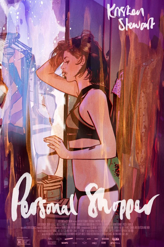
Tula Lotay
Tula Lotay's poster for Olivier Assayas’ Personal Shopper is rather lovely, isn't it? Love that lettering. As if being a bit good with a pen wasn't enough, it turns out that Lotay is also the brains behind Thought Bubble (Leeds' excellent annual comic art festival) and creative director of splendid comic shop Travelling Man. Lord only knows when she finds time to sleep. Check out her shop for more of this sort of thing.
Working from Home
“… and it wasn’t a factory, it was a prison! So they kicked everyone and turned into helicopters! And they flew off like THWOPPA THWOPPA THWOPPA!” — the boy is updating me on the latest escapades of his Transformers. I think. To be honest, I’m giving him completely divided attention. My brain is still upstairs on my desk, dealing with a flurry of demands that keep plinking into my inbox. It’s one of those weeks where all of the deadlines happen at once. Printers and art directors and marketers – everyone needs everything right now.
Read MoreMummy Brown
In the latest episode of fabulous design podcast North v South, there's a big discussion about how designers use colour. There's some mention of the origin of pigments, pre-Pantone, and one particularly gruesome bit of trivia is mentioned. Mummy Brown, a rich brown pigment popular amongst the Pre-Raphaelites, was made by literally grinding up Egyptian mummies.
Read MoreDecluttering the Desk
It’s a new year, and my work is down there somewhere, beneath sedimentary layers of paper and crockery and present-wrapping detritus and lord knows what; physical clutter that mirrors the mess of half-formed ideas, anxieties and distractions still lingering from 2016. It’s hard to get motivated. Time to tidy, to simplify, to start the year afresh.
Read MoreDune
It was announced today that Denis Villeneuve (Sicario, Arrival, Blade Runner 2049) has signed up to direct the new adaptation of Frank Herbert’s science fiction epic Dune. As good excuse as any to revisit the incredible concept art for Alejandro Jodorowsky's aborted 1970s version, by the likes of Jean “Moebius” Giraud, HR “NSFW” Giger and Chris “say, what do you reckon Rod Stewart would look like if he was a spaceship?” Foss. It's a shame none of this made its way onto the big screen (aside from Giger’s design for Harkonnen Castle, which appeared in Prometheus for some reason), so it'll be interesting to see if Villeneuve draws upon any of it for his new version, or if a similarly strong pedigree of contemporary concept artists can be corralled.