Cinema 2013

Crikey. Despite having a baby following me around all year, I think I've been to the cinema more than ever before! It's all down to the existence of City Screen's amazing baby club, Big Scream. Every Wednesday morning, one of their screens would be full of parents (mostly mums) and their babbling spawn.

The lights would be a little brighter, the sound would be a little lower, but you could sit there and watch a film without too much hassle. Brody would either sleep through it or play on the floor (this mostly involved stealing other babies' toys). It was great, and gave us all a nice family play-date to look forward to each week. It also meant we ended up seeing some absolute crap (The Paperboy), but there were some nice surprises too (I was surprised by how much I loved Les Miserables). 

It wasn't a stunning year for film, but there were a few that stood out: Gravity, Le Week-end, What Maisie Knew. Both Hobbits were great once you got past the fact that they were going far beyond the modest confines of the source material (although I still think Smaug should be pronounced "Smaug" rather than "Smaug"). All the superhero movies were jolly good fun too – I probably enjoyed Thor: The Dark World the most.

A few few big disappointments: Before Midnight threw away the charm of the first two films and just gave us two hours of pretentious bickering; Pacific Rim was embarrassingly shoddy in every possible way; and Danny Boyle followed up his triumphant 2012 ceremonials by … showing off his girlfriend's bits in Trance. That was odd.

Anyway, here's everything I saw on the big screen this year:

  • The Hobbit: An Unexpected Journey

  • The Impossible

  • Les Misérables

  • Lincoln

  • Hitchcock

  • Stoker

  • Oz the Great and Powerful

  • The Paperboy

  • Robot and Frank

  • Trance

  • Oblivion

  • The Place Beyond the Pines

  • Iron Man 3

  • Star Trek Into Darkness

  • The Great Gatsby

  • Man of Steel

  • World War Z

  • Before Midnight

  • Now You See Me

  • Pacific Rim

  • The Wolverine

  • The World's End

  • Alan Partridge: Alpha Papa

  • Kick-Ass 2

  • The Iceman

  • Elysium

  • What Maisie Knew

  • The Way Way Back

  • About Time

  • Le Week-End

  • Gravity

  • Thor: The Dark World

  • Saving Mr Banks

  • The Hobbit: The Desolation of Smaug

The evil prints

Scared. I'm being watched, and I'm scared. There it sits, gently humming away in the middle of the room, blinking its little red eye innocuously. A small but constant noise that sounds like a distant gateway to hell whispers from its guts. It remains still, but angry gears and indelible ooze threaten to churn into motion at any moment. Cheap, unreliable, sadistic. My printer. My evil, evil printer.

Read More

Ken Adam and the architecture of Apple

Like a reverse Godwin's Law, it's impossible to discuss Apple's approach to design without the word “Rams” popping up eventually. From the orange button on the Calculator app to the perforated aluminium of the Mac Pro (RIP) and every nice little touch in between, the influence of Dieter Rams' industrial design is all over Apple. His ten principles for good design are like holy commandments to Jonny Ive and his team – it's surprising that he isn't on the payroll.

Read More

The school of twitter

Using Twitter is a double-edged sword and often like being back at school: Everyone starts off trying to impress their peers and get the most friends in the playground, but most people question why they’re there in the first place …

Read More

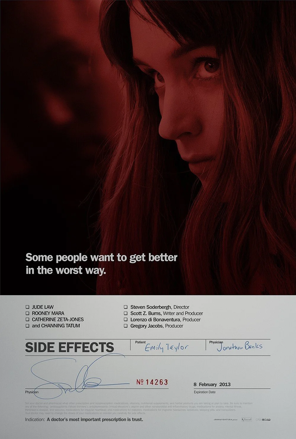
Side Effects

When it comes to contemporary film-related design, Neil Kellerhouse is head and shoulders above pretty much everyone else at the moment. I just love this poster for Side Effects. It immediately brings to mind Farrow's iconic pharmaceutical packaging for Spiritualized's Ladies and Gentlemen We Are Floating In Space, and yet doesn't come across as a conceptual rip-off. Maybe it's the red – I'm a sucker for red.

As for the film itself, I really enjoyed it. I went into it knowing little more than what's on the poster (I've been trailer-abstinent for almost two years now), and found it thoroughly entertaining and thought-provoking in equal measures. Yet another great turn from Steven Soderbergh. Hopefully not – as he has suggested – his last. 

So yes, poster and film: highly recommended. Just try not to get too distracted by Rooney Mara's post-Dragon Tattoo awksfringe.

Rediscovering albums

iTunes has reminded me that there's something special about a structured, deliberate collection of songs by a single artist. A good old fashioned beginning-middle-end snapshot of an artist at a particular time, requiring a bit of a time commitment. iTunes has returned me to a lifetime of slow listening.

Read More

A new source of inspiration

Jesus H. Corbett, I'm tired. I have sick in my hair, I ache, I don't know what day it is and I'm so very, very tired. Ten years ago, this would have simply meant it was Sunday, but these days it's all down to another very small, very big reason. Three months ago, Brody Benneworth-Gray popped into the world and brought with him a life of adorable chaos. And bits of sick.

Read More

Truth

Irma Boom:

I always say, when I’m asked whether the internet means the end of the book, that it really means the beginning of the new book. More books are produced now than ever before, but people use them in a different way. After all, you can read plenty of information on the internet now. Print, however, still looks like the truth.

Orwell's Six Rules of Good Writing

Adrian Shaughnessy's rather splendid-looking collection of essays, Scratching the Surface, has just landed on my desk. Whilst having an initial flick-through, a brief editorial note caught my eye: Shaughnessy credits George Orwell’s six rules of good writing (originally published in his essay Politics and the English Language) as the door that enabled him to progress a a writer – “my writing is always poorer when I forget one or more of them”. They are:

  1. Never use a metaphor, simile, or other figure of speech which you are used to seeing in print.

  2. Never use a long word where a short one will do.

  3. If it is possible to cut a word out, always cut it out.

  4. Never use the passive where you can use the active.

  5. Never use a foreign phrase, a scientific word, or a jargon word if you can think of an everyday English equivalent.

  6. Break any of these rules sooner than say anything outright barbarous.

I rather like them in their common-sense simplicity (even the ironic superfluous “always” in three). Almost like the word version of Dieter Rams' ubiquitous ten principles for good design. Get rid of all the junk and get straight to the point. Only what is necessary. I like that.

Bruno Munari on design as art

From Design as Art by Bruno Munari:

The designer of today re-establishes the long-lost contact between art and the public, between living people and art as a living thing. Instead of pictures for the drawing room, electric gadgets for the kitchen. There should be no such thing as art divorced from life, with beautiful things to look at and hideous things to use. If what we use every day is made with art, and not thrown together by chance or caprice, then we shall have nothing to hide. … It is therefore up to us designers to make known our working methods in clear and simple terms, the methods we think are the truest, the most up-to-date, the most likely to resolve our common aesthetic problems. Anyone who uses a properly designed object feels the presence of an artist who has worked for him, bettering his living conditions and encouraging him to develop his taste and sense of beauty.

Pickling

Walter Murch, Port #9:

When I was studying at the Sorbonne, I discovered Truffaut and Godard. Being in Paris aged twenty was like being pickled in cinematic vinegar: at the end of it, I thought, 'So now I'm a pickle, let's see where it goes.'

Port #9

I've been a big fan of Port since it appeared on the shelves a couple of years ago (thanks to magCulture for bringing it to my attention in the first place), and although the first few issues were incredible in terms of content and design, I was a bit worried that it couldn't possibly keep up that level of quality. Or, worse still, that it'd fall back on the usual men's magazine tropes to boost sales (Cars! Boobs! Cars with boobs!).

But here we are, nine issues in, and it's still bloody gorgeous. The latest, guest edited by Daniel Day-Lewis (hyphenated Daniels are all the rage right now), is the film issue. And it's pretty much my dream magazine. Eschewing the usual news and reviews – content more suited to the web – Port #9 embraces the slow reading strengths of the format with articles on all aspects of film, past and present. Particular credit goes to the photography – elegantly illustrating conversations with the likes of PT Anderson, Thelma Schoonmaker and Walter Murch. Add to this articles on cameras, costume and production design, the whole thing feels like a magazine for grown ups without ever feeling dry or pretentious.

I'd be quite happy if every issue of Port was a film issue, but I'm sure they've got something even better up their sleeves for #10.

Roaming

In theory, Apple's shiny pocket butler (yes, that's correct) is the ultimate travelling companion, equipped with all manner of adventurer's tools and guides. However, network providers see things differently. Using your iPhone as an iPhone anywhere but your home country is an extortionate, baffling ordeal.

Read More