You can’t beat an ultra-specific instagram account – one of my favourites is High School High, Veronica Kraus' collection/curation/whathaveyou of old high school yearbooks. Borne out of printing constraints, budgets, experimentation and good old-fashioned playfulness, there’s a wild charm to these designs. The naiveté-gusto of 1970s high school year book committee kids is a design force to be reckoned with; just pure unfiltered, unsullied teenage creativity. Grids be damned, this stuff is always a refreshing kick up the bum if you’re stuck on a job.
Michael Crichton
Michael Crichton on the importance of editors (in The Paris Review, 1994):
In my experience of writing, you generally start out with some overall idea that you can see fairly clearly, as if you were standing on a dock and looking at a ship on the ocean. At first you can see the entire ship, but then as you begin work you’re in the boiler room and you can’t see the ship anymore. All you can see are the pipes and the grease and the fittings of the boiler room and, you have to assume, the ship’s exterior. What you really want in an editor is someone who’s still on the dock, who can say, Hi, I’m looking at your ship, and it’s missing a bow, the front mast is crooked, and it looks to me as if your propellers are going to have to be fixed.
He was talking about writing, but this also captures the essence of a good designer/art director relationship. Working in isolation, it’s all too easy to lose sight of things. So many run-aground covers have been saved by an art director coming back to me with simple – and in retrospect, obvious – feedback. Sometimes it’s just a tweak of shade or size, but that extra perspective is invaluable.
Own Brand
I’ve finally got my hands on Own Label by Jonny Trunk, a look at the work of Sainsbury’s in-house design studio from the sixties and seventies. And it’s just lovely. There’s a lot of incredible design in there – and on the rather impressive Sainsbury’s Archive site – but it’s the typography-and-geometry stuff that really grabs me. The shelf-stacking, trolley-shepherding me from twenty-five years ago would find this fascination very strange indeed.
Pestering Artists About Their Pens
Jeffrey Alan Love recently tweeted a sketch, simply captioned “illustrator’s funeral”. Leaning over an open casket, a mourner asks one final question of the deceased: “What pen was that?”.
Read MoreA Burglar’s Guide to the City
I’ve been a fan of Geoff Manaugh’s BLDGBLOG for a years – his intelligent look at the world from a very particular architectural perspective makes it one of those blogs that leaves you feeling a little bit smarter after every visit.
Read MoreBackrow
So here's a little something that's been lingering in my “must get around to at some point” folder for absolutely ages. Backrow. It's nothing really, a crumb of an idea, but it's one that I keep coming back to: a basic magazine (or given that it'll be nowhere near profitable, probably more appropriate to call it a zine) with just one feature: a big conversation with somebody interesting about the films they love. Kind of like The Happy Reader … but about cinema rather than books.
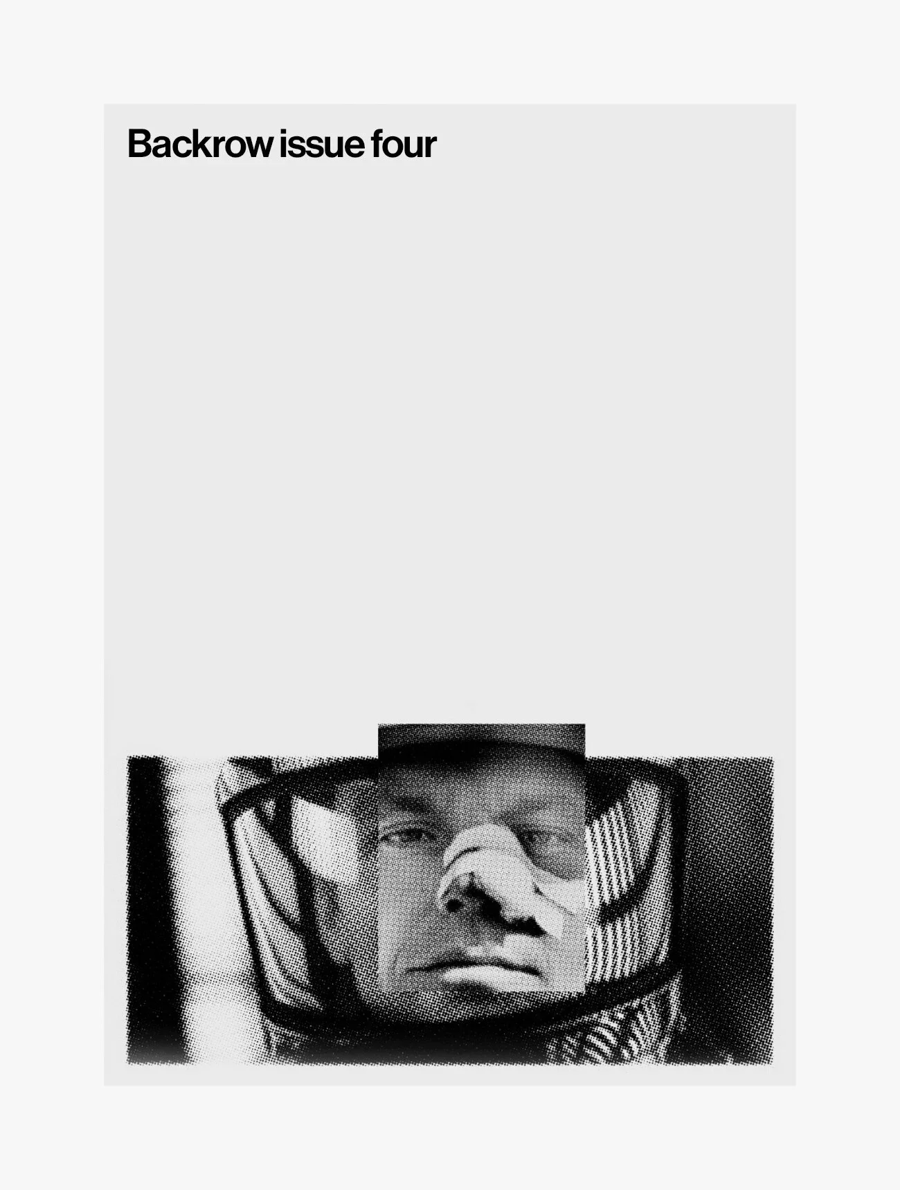
Right now, it's just a cover concept, an optimistic issue count and an idea. I have an actual proper BFI qualification in film journalism (yes, it's a thing) that is going to waste, so this definitely represents a professional itch needs to be scratched.