After ten years, I’ve wrapped up my regular Creative Review column. Have a delve through the archive to read me babbling on about desks and comics and social media and spines and colour and stationery and typefaces and flaneurism and indices and indecision and mental spillage.
Mishka Henner
Mishka Henner's work explores and subverts the value of photography in today's media-saturated world. And it’s fun. Personal favourites: the scale model of our solar system in book form; power stations’ evaporation ponds composed from satellite imagery; and the series of paintings of – and priced according to – the Fibonacci sequence.
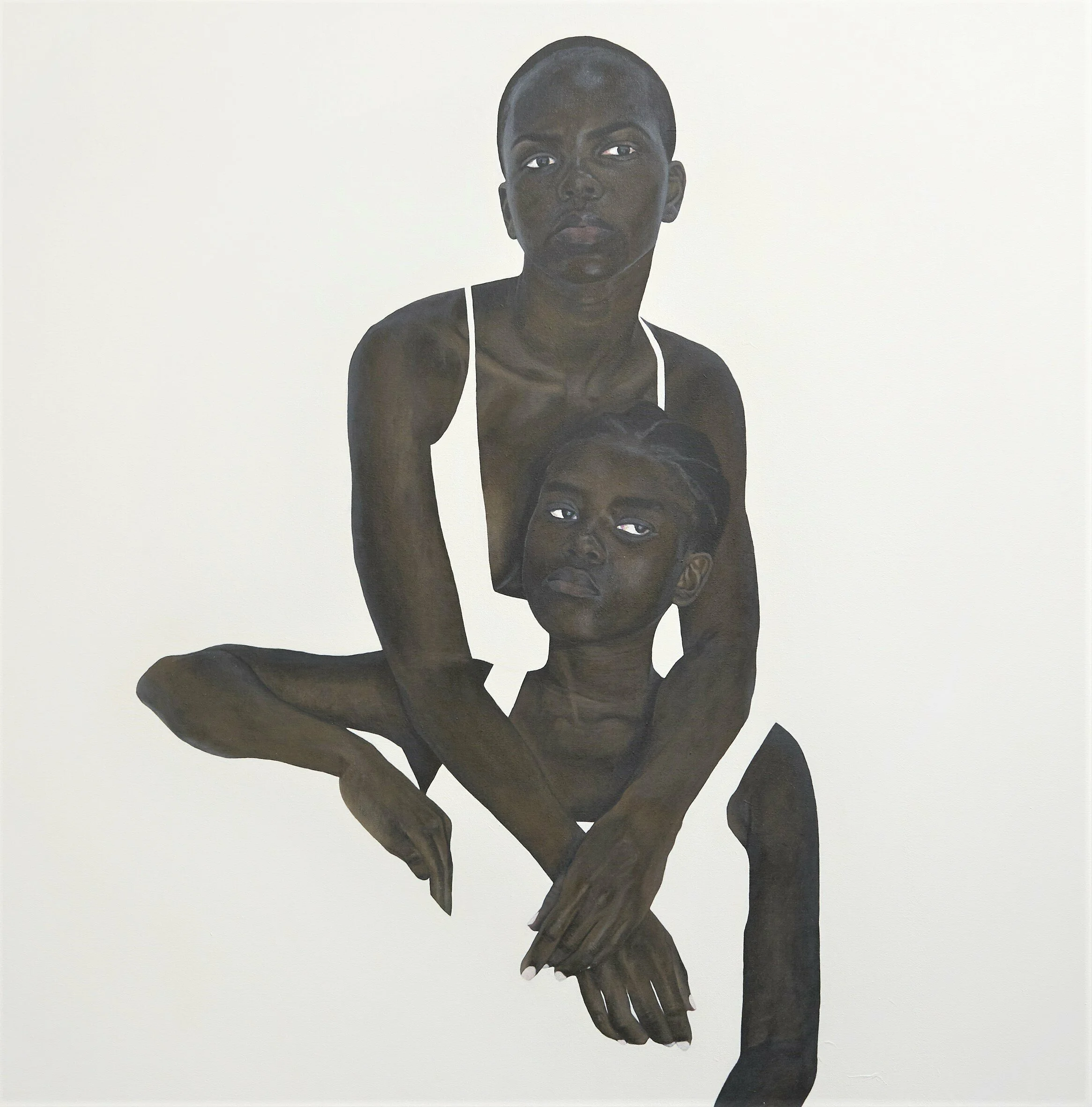
Sungi Mlengeya
I found Tanzanian artist Sungi Mlengeya’s paintings … okay so I forget where. She’s been living in my browser for six months, a monochromatic oasis of calm I’ll occasionally linger on while coasting from tab to tab. Her positive-as-negative use of space, as with Rozenn Le Gall’s work on fields of black in last week’s Meanwhile, it's like catnip to a book designer. So striking from a bookshelf, so much space for copy! The “early works” bit of her site is worth a look, where you can trace the development of her approach from one painting to the next; the always-fascinating artists’ journey to a signature style. Intrigued to see where she goes with it next.
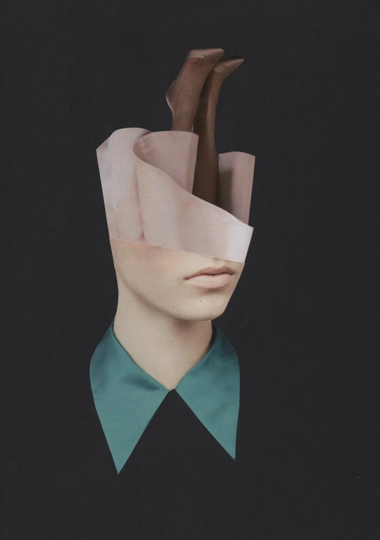
Rozenn Le Gall
I first discovered Rozenn Le Gall’s work on the cover of Rebeka Elizegi’s excellent collection Collage by Women; a simple but striking juxtaposition of face and feet. Immediate and distinctive, her pieces are particularly well-suited to book design; just one or two carefully selected and composed elements against a spacious, solid … I want to say field? Backdrop? Substrate? Do we need better/more technical terminology for collage? Or perhaps it’s already out there and I haven’t found it? Anyway, I’ve gone and distracted myself, basically her work is fab and worth exploring further. Here’s a few of my favourites.
ABCD
It was a massive joy to attend the ninth ABCD (Academy of British Cover Design) awards last week, celebrating the best covers of the past year. Book design is a fantastic industry and community to work in, so any excuse for us all to converge on one place for a knees up is most welcome. Too often we’re just names behind emails – there was an awful lot of oh so that’s what you look like! – so it was good to finally meet people I’ve worked with for years. Massive thank you to organisers Jamie Keenan and Jon Gray for continuing to make this a thing.
Beppe Giacobbe
This week, I have mostly been transfixed by the work of Italian illustrator/artist Beppe Giacobbe. He’s got an incredible portfolio of editorial work to his name, but what’s really caught my eye is this recent mixed media series of “accidental portraits”; print and collage and calligraphy all stirred together in exactly the right quantities. If higher praise were needed, I find myself scrolling through them, muttering should be a book cover … should be a book cover … should a book cover. If one of you art directors hasn’t seriously considered picking these up for a series design by the time I’ve finished this sentence, I’ll be very, very cross indeed.
Craig Ward
This week I caught up with British-born/New York-based designer Craig Ward, whose work I’ve admired for years – particularly his typographic experiments with bacteria with ferrofluid and light. Recently he’s been playing with LEGO, creating a series of studies that he's collected on his instagram account Brik Font. LEGO? Type? I must know more …
Read MoreB. D. Graft
I keep returning to this WePresent post from a few years ago – Is it mine if I add some yellow? – that features the work of Dutch artist B. D. Graft, who has … well, he’s added some yellow. It raises interesting questions about artistic ownership, copyright and the concept of culture-as-collage; issues increasingly on my mind, the further I delve into using and adapting found images in my own work. Take this first piece: who/where is its author? Is it the sculptor? The photographer that shot the sculpture? The publisher of the book containing the photograph of the sculpture? Or the artist who placed a bit of yellow over the page of the book with the photograph of the sculpture? Does any of it matter as long as I get to look at nice big blobs of that very particular shade of of almost-orange yellow that has lived in my heart since getting a Scalextric Ayrton Senna Lotus for my 14th birthday?
John Gall
I’m slowly coming around to preferring the antiquated (but arguably more accurate) title commercial artist to designer. John Gall absolutely personifies this aspiration. A constant peruser of others’ portfolios, I’ve followed his book designs for years (his cover for Shalom Auslander’s Hope is an absolute classic), but more recently I’ve been delving into his illustrative work, particularly these pieces for the New York Times. I don’t know what you’re looking for in collage, but these absolutely tick all of my geometry, texture and obfuscation boxes. Lots more on John’s insta, but it’s also worth checking out some of his older sketches and his out-of-print monograph from a few years back, if you can find it.
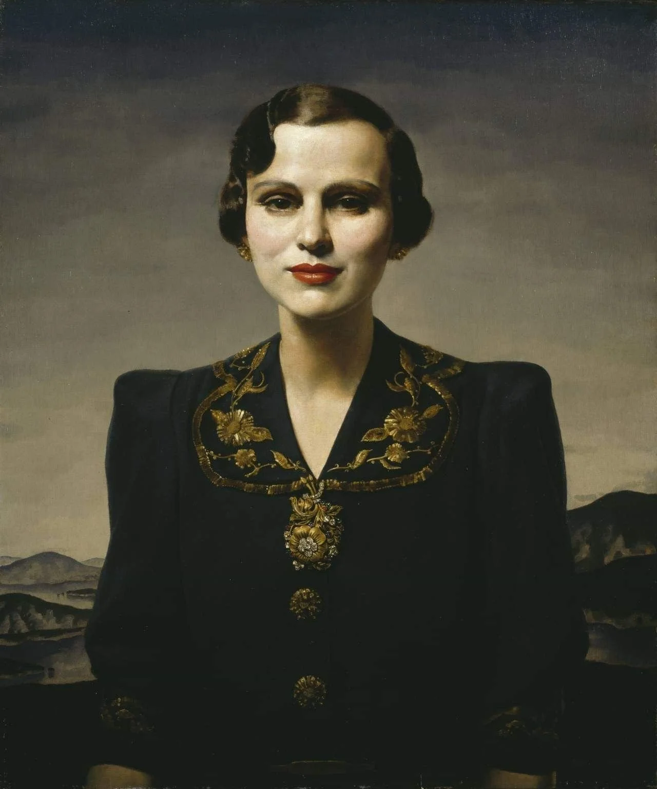
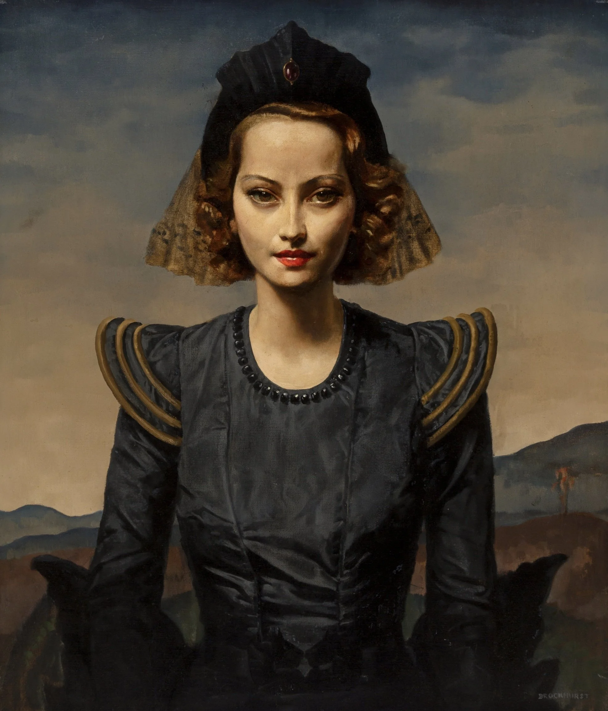
Gerald Brockhurst
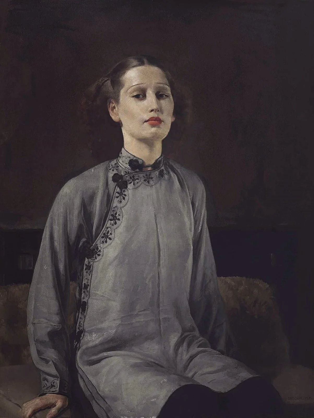
I have a bit of a love-hate relationship with Pinterest. The glory days of it being a does-one-thing-perfectly image bookmarking site (you know, like an interesting pinboard) are long gone; simplicity crushed by feature sprawl and muddled purpose. But beneath the mess, it occasionally works algorithmic sorcery and finds something new/old that lands smack dab in the middle of your taste. For example, I’m not sure what I pinned that made it decide I absolutely must be bombarded with Gerald Brockhurst paintings (perhaps it was somehow aware that I’d been watching A Very British Scandal, starring Claire Foy as the Duchess of Argyle?) but thank you very much, oh wise and sentient website. I wasn’t familiar with his work before and I’m now obsessed with it. Give me any of these weirdly gothic society portraits over the Mona Lisa any day. Brockhurst’s work has yet to be gathered in one place online, so decent versions of his paintings are scattered across various websites – each of these pics link somewhere different – so enjoy following me down this new rabbit hole.
Katrien De Blauwer
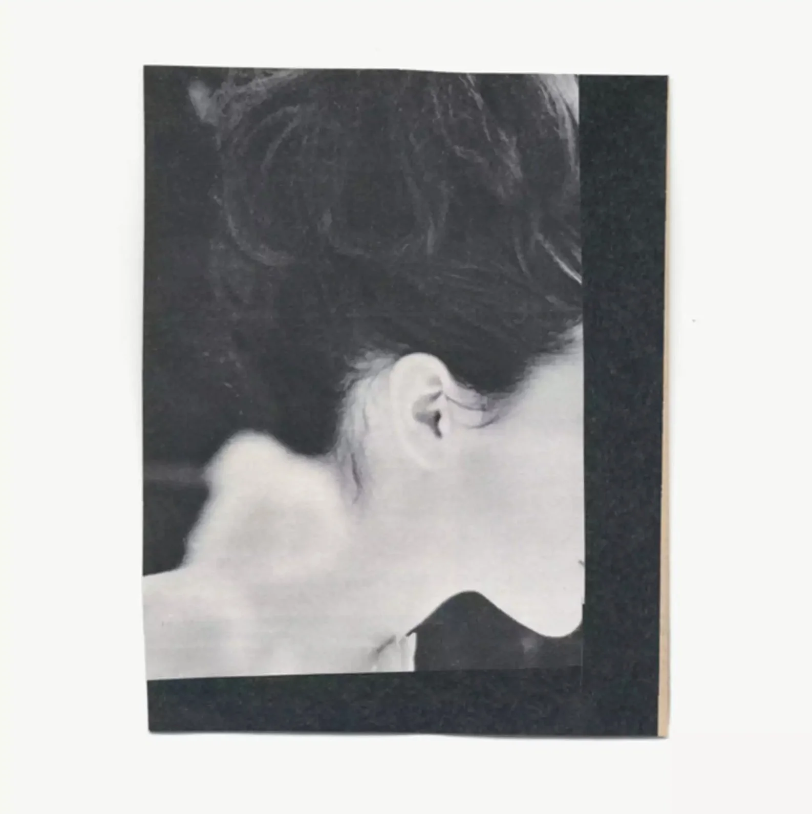
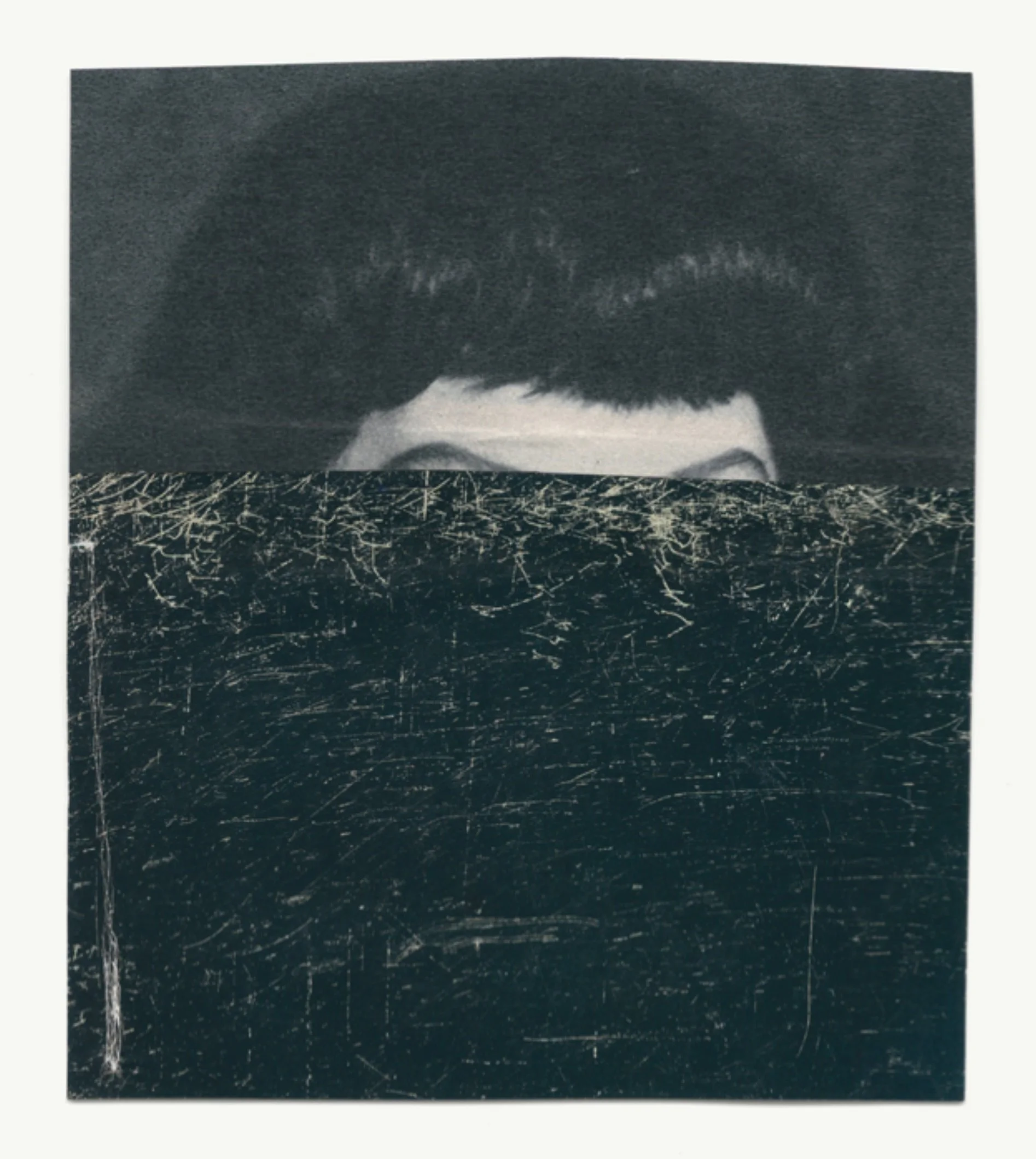
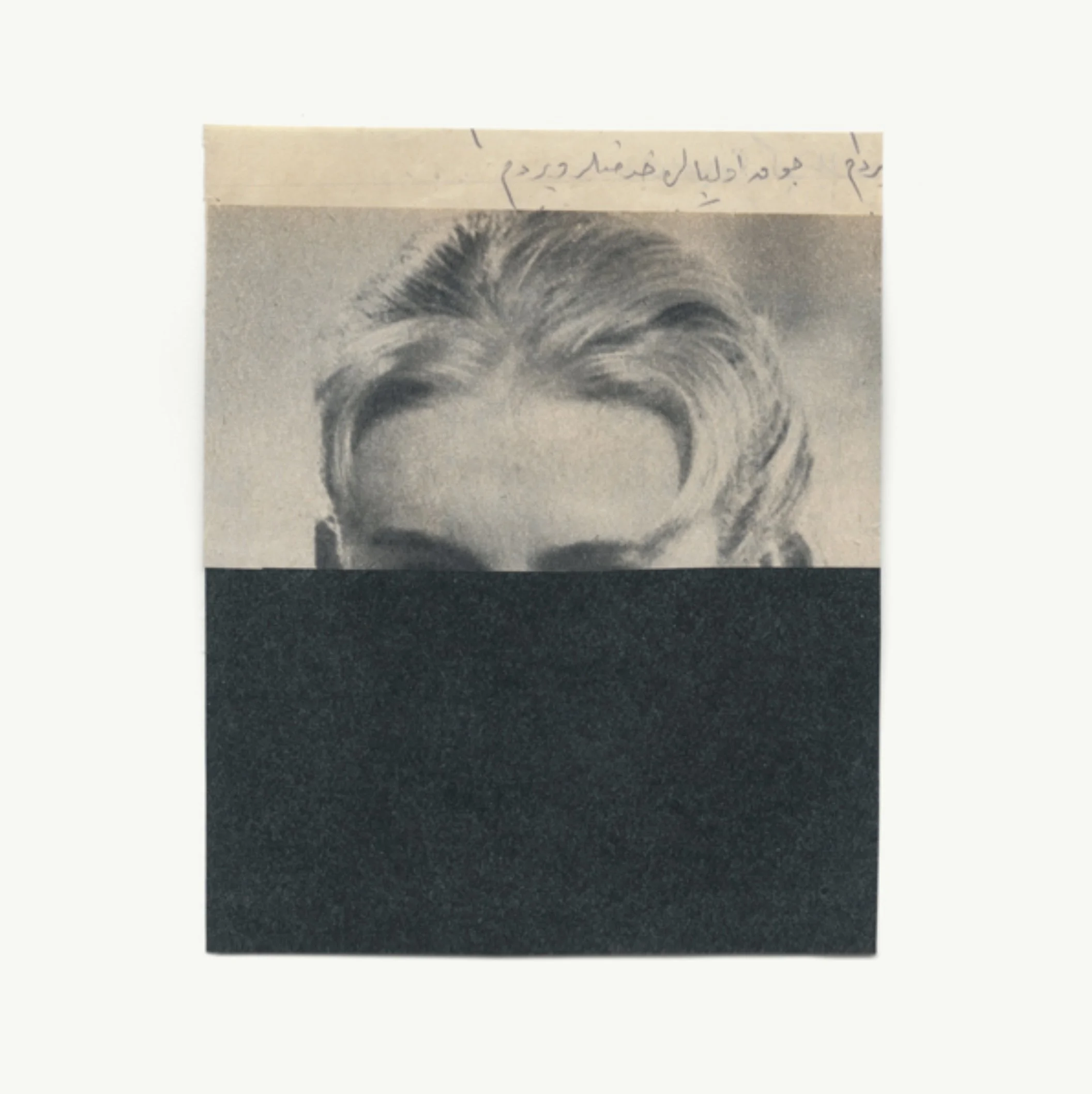
Belgian collage artist – or as she describes herself, photographer without a camera – Katrien De Blauwer has taken up permanent residence in my tabs recently. Drawing upon – or rather cutting up – a vast collection of vintage magazines, her works are small, unrefined, yet delicate; as much about the yellowing of paper and imperfections of print than the actual images they disrupt.
She’s published a number of collections, with titles like You Could At Least Pretend To Like Yellow and Why I Hate Cars, but a more affordable taster can be found in Port #26. I’ve yet to see any of her pieces in the flesh (this selection is taken from Artsy), but I bet they smell incredible … if that’s any measure of art.
We Buy White Albums
As the world slowly absorbs Peter Jackson’s epic Get Back, it seems like as good a time as any to catch up on one of my favourite ongoing art-things: We Buy White Albums.
In response to Peter Blake’s wonderfully populated Sgt. Pepper’s sleeve, artist Richard Hamilton conceived an act of pure pop-minimalism for The Beatles’ eponymous 1968 follow-up: nothing. The first pressing was plain white, aside from a printed serial number (“to create the ironic situation of a numbered edition of something like 5 million copies”) and “The BEATLES" set in Helvetica, blind embossed into the sleeve. Every record was more or less identical … for a while.
Cut to fifty or so years later and artist Rutherford Chang has (so far) collected 2,952 copies of The Beatles aka the White Album. It’s fascinating to see so many of those sleeves in one place; a work of multiples, reunited. Time and nature have left patterns – over the years, many have acquired mould or been patched up with tape; all have been subjected to yellowing and ringwear. But Chang’s collection reveals a more fascinating and wild force of nature: the lure of the blank canvas. Stickers, labels, doodles, lists, stamps, copious amounts of biro, love notes, horrifying portraits, marginalia (vinylania?), corporate mascots, e e cummings – all life is here.
Emigre in the Letterform Archive
There’s a thousand reasons to rave about Letterform Archive’s growing collection of lettering, typography, and graphic design, but I always end up being drawn to the full-issue scans of Emigre magazine. You want an education in eighties/nineties typography? Set a day aside, open these up and absorb.
Guardian Saturday
”I think the most successful ones are the ideas we come up with straight away. If you’re still working it out five meetings later, then probably the idea isn’t that good.” Since its creation in late 1988, the Guardian’s Saturday supplement has been lauded for front covers and features that have caught the eye and sparked joy or sometimes controversy. As its final edition is published, some of the team who worked on it explain how they brought the magazine to life.
Projekt 26
“The artists shunned conventional layouts and hierarchy by integrating type and graphics rather than viewing them as separate elements. It may have been partly because fonts weren't available, so every letter was hand-drawn.” — Creative Boom chat with Projekt 26 about the increasingly influential field of Polish poster design.
All the Marvels
“I’ve probably done permanent damage to myself” — Comic Journal’s Laura Hudson interviews Douglas Wolk, whose new book All the Marvels follows his five year quest to read every single Marvel comic book published since 1961, from issue one of Linda Carter, Student Nurse (yes really) right up to the present day. That's around 27,000 issues, or 540,000 pages.
Why are Blackwings so popular?
Why are Blackwings so popular? The most eye-opening part of this profile of Blackwing pencils is the absurd production journey: after being made with Californian cedar in Japan, they go back to California to have the eraser stuck on. And this is before they've shipped to wherever you are.
Little Simz
I’m a bit obsessed with the new Little Simz album, Sometimes I Might Be Introvert. As well as being generally fabulous, what really gets me is her incredible breathing control absolutely blows my mind. Seriously – try singing along to any of the tracks and you’ll be a hyperventilating mess on the floor within seconds. Anyway, respiratory wonder aside, this Seb Emina interview for The Gentlewoman is well worth a read.
Little Women
My favourite minute of cinema this year: the book printing/binding scene from Little Women. The whole film is wonderful, but this moment is particularly mmmm.
Batkidd
A Batman memory by Chip Kidd:
The initial image and presentation of the ‘Bat-Man’ was so much weirder, scarier and cooler from what I was used to on 1960s TV, it seemed like I was seeing the actual, real depiction of him in these comic book pages from 1939. Also, the writing of the stories was very dream-like, in a strange, ‘we’re-still-trying-to-figure-this-out’ kind of way.
