Photographer Peter Byrne visited 45 different ranches in twelve states to capture the life of the contemporary cowboy. This Land, designed by myself, is the result of this shooting adventure. The book is launched this weekend at Print Stuff, York's new independent print and publishing fair, and is available to buy from Peter's shop.

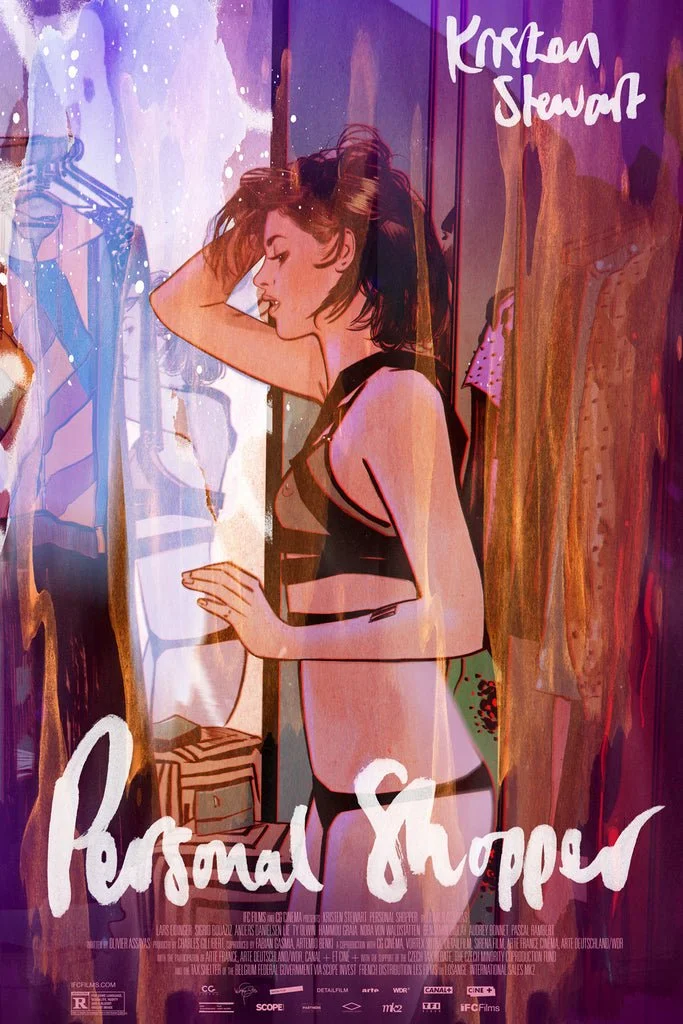
Tula Lotay
Tula Lotay's poster for Olivier Assayas’ Personal Shopper is rather lovely, isn't it? Love that lettering. As if being a bit good with a pen wasn't enough, it turns out that Lotay is also the brains behind Thought Bubble (Leeds' excellent annual comic art festival) and creative director of splendid comic shop Travelling Man. Lord only knows when she finds time to sleep. Check out her shop for more of this sort of thing.
Working from Home
“… and it wasn’t a factory, it was a prison! So they kicked everyone and turned into helicopters! And they flew off like THWOPPA THWOPPA THWOPPA!” — the boy is updating me on the latest escapades of his Transformers. I think. To be honest, I’m giving him completely divided attention. My brain is still upstairs on my desk, dealing with a flurry of demands that keep plinking into my inbox. It’s one of those weeks where all of the deadlines happen at once. Printers and art directors and marketers – everyone needs everything right now.
Read MoreMummy Brown
In the latest episode of fabulous design podcast North v South, there's a big discussion about how designers use colour. There's some mention of the origin of pigments, pre-Pantone, and one particularly gruesome bit of trivia is mentioned. Mummy Brown, a rich brown pigment popular amongst the Pre-Raphaelites, was made by literally grinding up Egyptian mummies.
Read MoreDecluttering the Desk
It’s a new year, and my work is down there somewhere, beneath sedimentary layers of paper and crockery and present-wrapping detritus and lord knows what; physical clutter that mirrors the mess of half-formed ideas, anxieties and distractions still lingering from 2016. It’s hard to get motivated. Time to tidy, to simplify, to start the year afresh.
Read MoreDune
It was announced today that Denis Villeneuve (Sicario, Arrival, Blade Runner 2049) has signed up to direct the new adaptation of Frank Herbert’s science fiction epic Dune. As good excuse as any to revisit the incredible concept art for Alejandro Jodorowsky's aborted 1970s version, by the likes of Jean “Moebius” Giraud, HR “NSFW” Giger and Chris “say, what do you reckon Rod Stewart would look like if he was a spaceship?” Foss. It's a shame none of this made its way onto the big screen (aside from Giger’s design for Harkonnen Castle, which appeared in Prometheus for some reason), so it'll be interesting to see if Villeneuve draws upon any of it for his new version, or if a similarly strong pedigree of contemporary concept artists can be corralled.
Willem Sandberg's rules for poster design
Willem Sandberg's rules for poster design:
A poster has to be joyous.
Red has to be in every poster.
A poster has to provoke a closer look, otherwise it doesn’t endure.
With a respect for society, designer and director both are responsible for the street scene, a poster does not only have to revive the street, it also has to be human.
Every poster has to be an artwork.
Michael Johansson
Swedish artist Michael Johansson creates wonderful sculptural installations by – please stop me if I'm going too fast for you here – arranging stuff into shapes. Okay, there's probably more to it than that. There's something exceedingly satisfying about the way he seamlessly piles a bunch of unrelated things into a doorway just so, suggesting unlikely relationships between object and architecture. May the world forever be his Tetris.
Dead Bookstore
Ben Pieratt's new project – Dead Bookstore – is such an exceedingly simple and elegant idea, it seems odd that it hasn't been done before. Basically, he breaks signature-bound books down into individual sheets and looks for interesting unintentional compositions that can be framed as art. Images that would've been pages apart in the book now lay side-by-side, contrasting and interrupting each other. The results are quite beautiful – I may start plundering charity shops for potential cadavers to disassemble.
Feathered Dinosaurs by John Conway
Hollywood may be lagging behind on this, but it's becoming increasingly apparent that dinosaurs were a lot more like birds than we previously thought. Recent discoveries suggest that many of them were in fact feathered (this article from Living Bird tells you everything you need to know); it's unlikely they were the big scaly lizards you grew up with. John Conway is one of several illustrators playing catch up with this paleontological revelation, revising our idea of what dinosaurs may have looked like. It's incredible what a difference this detail makes to our perception of dinosaurs and birds – the image of a velociraptor preening its feathers is particularly striking. Time for a CGI-corrected version of Jurassic Park perhaps?
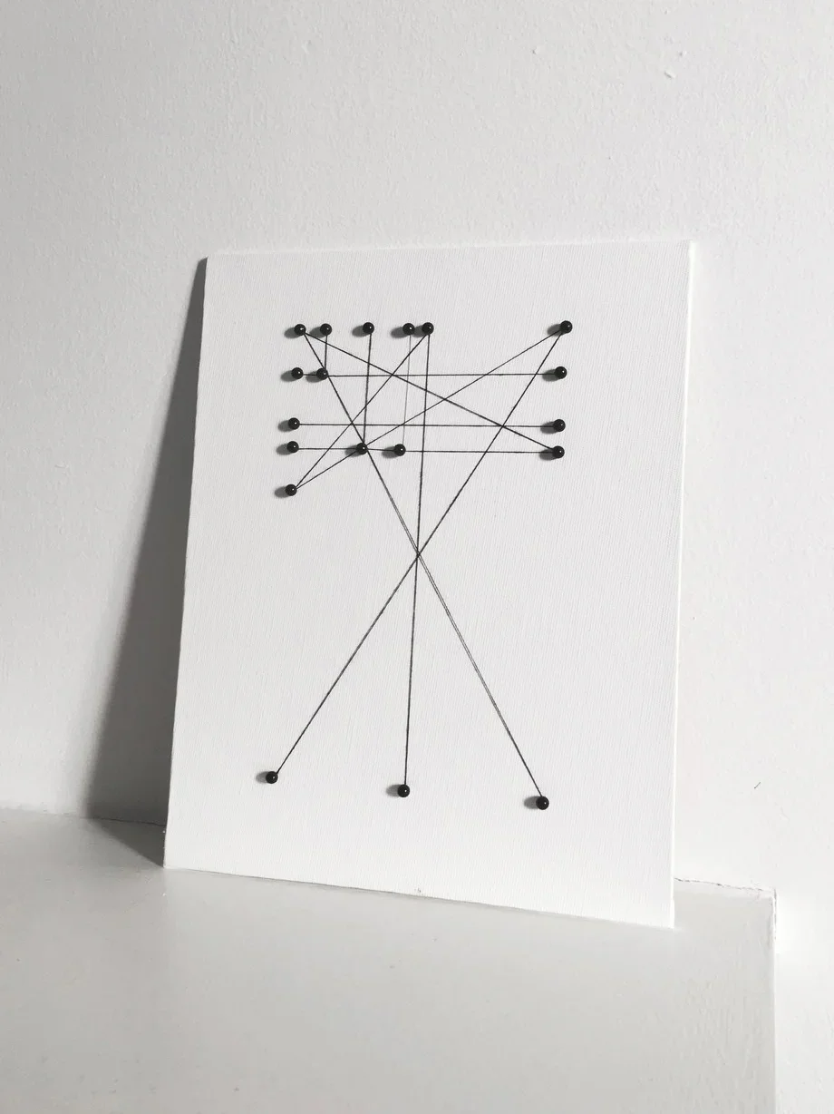
Homage to Romek
Something really rather wonderful has arrived in the post: the Marber Grid, recreated by everyone’s favourite design blogger (and bloody nice chap) Richard “Ace Jet 170” Weston, using nothing but cotton thread and map pins. Look at it there, being all rational and beautiful and pinny. It has immediately found it’s way into a permanent spot on my otherwise sparse desk.
Update: Richard is now selling these to order on his site. Go get.
Full Table
I’m sorry. By the end of this post, I will have completely eradicated all productivity from the rest of your day, simply by mentioning fulltable.com.
Don’t worry, this isn’t the first of a ‘hey check out this URL, it’s like totes inspirational’ series (if I was going to do that, every month would simply be a link to that site where a life-size blue whale swims through your browser window), but this site, The Visual Telling of Stories, is rather special. I simply had to share it … and not just because I thought there was a small chance that it was maybe cursed.
I originally stumbled upon it whilst on one of my regular excursions around Google, looking for obscure/large/copyright-free images with repurposing potential; visual rare grooves ripe for sampling. Usually, this journey ends in the darkest recesses of Flickr, but this time I found myself tumbling down a new rabbit-hole. First I was perusing some Japanese family crests. And then I found a thing about 1930s cattle branding … some diagrams demonstrating frisking technique … a bawdy 1959 magazine called Sir! … an entire book about correct serviette usage … it just kept going.
And now I can’t close the tab, I’m hooked. As well as all of the wonderful content, part of the site’s charm is how easy it is to get lost. It’s vast and labyrinthine, no two pages offering the same navigation options. With it’s complete disregard for the user experience or consistent design (each page appears to have been built from scratch), and reliance on buttons and tables, I initially assumed it was a mothballed site from the 90s. But further investigation revealed that it is still very much a going concern.
The site was created and is maintained by Dr Chris Mullen, initially as a place to host supporting material for the University of Brighton’s Narrative Illustration/Editorial Design MA, but has since taken on a life of its own. Now there are hundreds of pages of visual material from books and magazines and maps and pamphlets, updated regularly, messily. The best way I can describe it: imagine what a cross-section of Terry Gilliam’s head would look like.
On one page – Mullen’s explanatory notes are somewhat scattered – there’s a note on the aroma of the site (“If it were possible I would send you the smell, the evocative odour of the period paper”); elsewhere there’s a rationale for the deliberate anti-design of it (“I hate so many other websites for their appearance of gentility … their slow wittering release of uncertain information in electric blue 6 point chatter … Web designers are a bloodless brood”). It’s rather refreshing; in a medium that is in a constant state of erasure, here’s something that transcends decades of progress and accepted standards of how a website is supposed to function. And it’s one of the finest resources of public domain material I’ve ever come across. Or, in Mullen’s own words:
A LYRICAL ENCYCLOPEDIA OF VISUAL PROPOSITIONS
RUGGED DESIGN IN OPPOSITION TO ELEGANCE
IT’S BIGGER THAN YOU COULD EVER THINK
JUST EXPLORE — NO CLUES FROM ME
And just like that, your day is ruined. There’s no point resisting. I know you intended to get all of those important tasks done, read the rest of this magazine, maybe even check out that whale thing; but instead you’re going to sit right there and gaze at scans of A Juggler’s Guide to Social Interaction, Part One and wonder what happened to your life. I really am sorry.
Times Haiku
Okay, so this is a couple of years old now, but I'm a sucker for unintentional poetry. Times Haiku is a tumblr created by New York Times senior software architect Jacob Harris, using an algorithm that pulls unintentional haiku-able strings of words from NYT stories. And it is wonderful. As well as exposing lovely snapshots of zen hidden within popular culture, it also serves as an interesting news aggregator – I'd gladly pore over the morning's headlines in this format.
★
For almost a year now, I've owned a sealed copy of David Bowie’s final album, ★. And I haven't listened to it, not once. Somewhere between ordering it and receiving it, the unthinkable happened and the context of David Bowie's final album changed in an instant.
Read MoreDesigning for Architects
One of the great things about being a designer – particularly a book designer – is that you’re constantly exposed to a diverse array of industries and subjects. Every job opens up windows to peculiar corners of the universe and little educations in big subjects. For example, on my desktop syllabus right now I have titles on history, film, economics, psychology, art and architecture.
Read MoreBackrow
So here's a little something that's been lingering in my “must get around to at some point” folder for absolutely ages. Backrow. It's nothing really, a crumb of an idea, but it's one that I keep coming back to: a basic magazine (or given that it'll be nowhere near profitable, probably more appropriate to call it a zine) with just one feature: a big conversation with somebody interesting about the films they love. Kind of like The Happy Reader … but about cinema rather than books.
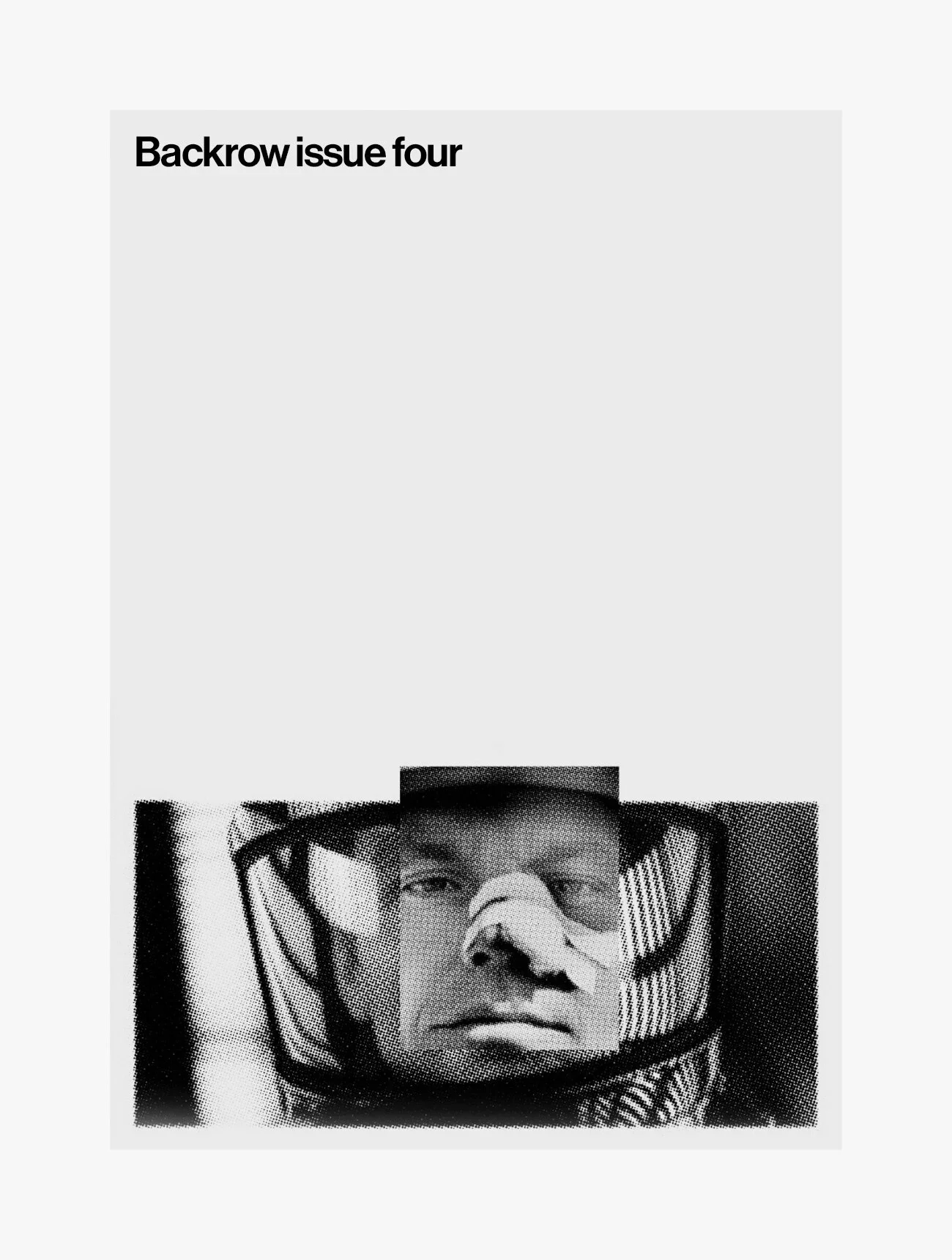
Right now, it's just a cover concept, an optimistic issue count and an idea. I have an actual proper BFI qualification in film journalism (yes, it's a thing) that is going to waste, so this definitely represents a professional itch needs to be scratched.
The End Matters
It’s offensive o’clock in the morning, I’m sweatily clamped into my headphones, my desk a Spirograph of fresh coffee rings. I’ve been here for hours. And right now I’m very aware that I’m not doing two of my favourite things: creating and blinking.
I’ve been designing a big book for the last few weeks; the sort of big book that has lots of big chapters and big pictures and big contributors with big words. After lots of to-ing and fro-ing with editors and proofreaders and publishers, we’re at that very special final stage: the index.
All of the other little details have been shuffled into place and nudged and tweaked. Everything has been checked and double-checked; all of the content has been corralled into pages. It’s all locked down apart from this last section.
Typesetting this soup of text is the antithesis of designing a cover (or postcard or poster or anything that’s basically a single big rectangle). That involves a lot of sitting back, wandering to the other side of the room, narrowing the eyes, staring at compositions of shapes and colours. The cover is an expression of the book’s intent, all on one page.
When it comes to this dense swamp of minuscule text, it’s quite the opposite: the index is about atomising the book, breaking it down to its constituent parts. Whereas the effect of the cover is instant, the end matter (indices, appendices, references) must chug along silently in the background. Any flaws may not present themselves for months, years. But if they’re even a little bit off, they’ll be there, gnawing away at the innards of the book.
So getting these details correct is vital. I lean into the screen, nose pushed up against the design, unblinkingly scrutinising every tiny detail. Checking and checking and checking. Does this entry match up with that page? Is this word correctly italicised? Should those be a subset of those? Does this hierarchy of indents make sense? Have I forgotten how the alphabet works? What are numbers? The eyes and brain tend to dry out a little.
It’s a good working-through-the-night kind of job though, as it involves a lot of stillness and repetitive routine. The jazzier parts of the brain can be switched off for a while. There is very little room for stylistic interpretation or creative expression of the content; it’s simply about finding the exact shape that the words must fit. It’s the difference between making a collage and doing a jigsaw. Which makes it sound boring, but I kind of enjoy it – going through the motions of piecing bits together is oddly satisfying.
And these words are such wonderful pieces to play with: nomenological, architectonic, jurisprudence, baptistry, tabernacle, cosmogenic. Tasty, crunchy words. Countdowny words. I can’t say that I know what half of them mean, but at least I know where they appear.
Although it isn’t expressive in any way, this process feels significant; it gives the book meaning, usefulness, substance. A body of text with a delightful cover is all very nice, but it’s these layers of indexing, cross-referencing, associations – routes in and out and through the text – that make it a functioning object, a machine for thought. A machine that I’ve very almost, almost finished working on. That’s the main reason I enjoy this: it’s the last thing I do before all of this work becomes real. The end matters.
And then tomorrow I’ll be back to flouncing creatively with words and pictures and colours. First though, I need to finish this index and maybe get some sleep, or at least have a really big blink.
Habits of the Caffeinated Designer
13:05 — Right, I’ve got two hours. I just need to get myself coffee and cake, get as much work done as possible, and then collect the boy from nursery. Time for a bit of the old ultra-productivity!
13:15 — Queuing. I’m ashamed to say that in these situations, I generally decamp to a dependably generic chain coffee shop rather than support a local independent business. I’m sorry, numerous wonderful haunts of York, but when I’m trying to get my head down to some proper serious work, the last thing I need is a place full of damn distracting character. I can’t be doing with your pleasant decor and considerate service and homemade salty tiffin. I’m not here to enjoy myself. I want sterile and beige and nothing. Table service would be nice though.
13:20 — Still queuing. It’s okay, not time wasted. I’m able to give careful consideration to the precise beverage/pastry combination required for the tasks ahead of me. One must aim for a delicate balance of maximum fuel efficiency and minimum bladderial impact – thank you, inventor of the flat white. As for pastry, that choice is generally governed by the kind of book I’m working on: non-fiction, croissant; fiction, almond croissant; series design, scone. You already know this stuff – it’s basic, day one design logic.
13:25 — I have my coffee, a boring croissant, and most importantly, a good table. There’s a socket. There’s nobody behind me. And there is sunlight – or at least a view of a part of a window display that probably faces the outside somehow. So that’s my vitamin D sorted. I’m poised and ready to go.
13:30 — I’ve carefully prepared my workstation. Notebook, phone, iPad, stylus, pen, coffee, croissant, emergency back-up notebook – all unpacked and carefully arranged in front of me in a tidy grid that I’m a little too proud of. I’ve identified fellow workers at neighbouring tables; anonymous colleagues unwittingly setting the pace for my typing and tapping. Okay, so now I’m poised and ready to go. I just have to check these few notifications first …
13:50 — Now that was an amazing tweet. Insightful, witty, a little bit dangerous. That one deserves to go in the scrapbook. Now where was I? Ah yes, poise, readiness.
14:00 — The caffeine has kicked in. Suddenly all of the work is happening. Sketches are being sketched on various surfaces, one haphazardly-drawn cover after another. Sooner or later one of these appalling rectangles will give way to a gem. I look around, my co-workers are on fire too. This is good. Maybe we should set up an agency together. This is good.
14:15 — Still going. No distractions. The uniform inauthenticity of this place is emphasised by the corporate art adorning the walls: canvas-printed stock images of beautiful Italian folk, drinking what appears to be far superior coffee in a proper café, somewhere sun-drenched and rustic. There are scooters, cobbles. Fresh fruit tumbles gaily from a punnet. It’s a Mediterranean coffee-drinking ideal so far removed from the one I’m actually experiencing, it’s as if I’m actively being mocked for my custom. When I do occasionally peer up from my screen, the immediate response of “well this is all slightly awful, I bet I should have some strong opinions about their tax arrangements” is enough to push my gaze back down again.
14:25 — My unnamed buddies have left. I’m suddenly conscious that I look like a complete twerp, making dramatic swooshes on my screen. The stylus really is a smug peripheral, this year’s bluetooth headset. And I’ve been sitting here with empty crockery for quite some time now. I don’t want to pack all of my things up just so I can go back up to the counter. How long is it okay to sit here and not spend more money? Am I technically loitering now? I stay where I am, thirsty, unpaying, socially awkward, gesticulating wildly.
14:45 — My inconsiderate body presents other … urgencies. This just intensifies/destabilises the work. Sketching becomes scribbling becomes pen-drumming. It all goes a bit Buddy Rich for a while. Environmental patterns emerge – the flow of customers coming and going; the grind and hiss of the coffee machines; the loop of the barista’s limited stock of chirpy salutations. I wonder how much of this caffeinated rhythm is seeping into my work. I like it here. It’s awful.
15:10 — Getting thirsty. So many rectangles. And some oblongs. Still no gem. Maybe another coffee. Am I meant to be somewhere? I’m pretty certain I’m meant to be somewhere. More rectangles rectangles rectangles rectangles rectangles
Tschichold’s Ten Common Mistakes in the Production of Books
I recently found Jan Tschichold's The Form of the Book: Essays on the Morality of Book Design on Scribd (proper real-word editions are still available on Amazon, as long as you're willing to smash the studio piggy bank). The book collects various things that he wrote on design and typography throughout his career, but there's one bit that I keep returning to (possibly because it's a nicely-digestible list): ten common mistakes in the production of books.
Read MoreFreelancer on Holiday
This is incredible. Myself and the wife and the boy have managed to juggle schedules in such a way that we now have a week off. I'm not entirely sure how we did this. Sorcery may have been involved, souls bartered, something dark and unnatural that will one day tear us asunder. But hey, a week off is a week off.
Read More